Quantcast
Channel: APEX – HardLikeSoftware
Viewing all 52 articles
Browse latest View live

APEX IG Cookbook Update

$
0
0

Here is an update (revision 2) of the Interactive Grid Cookbook. You can download it here. This revision adds an example of reordering rows. This has been asked for on the APEX discussion forums. The example is a task list editing page.

The example also shows a workaround for the “no data found” error that can happen when saving data if the SQL statement has a where clause. When the IG SQL statement has its own where clause, such as “... where EXAMPLE_COL = :P1_CURRENT“, if the column is editable and the user changes the value so it no longer matches the where expression you get the error. The reason is that as part of saving the data the IG Automatic Row Processing (DML) process tries to get the latest values for edited records and if a record is now out side of the result set because of the where clause you get the error. A number of people have run into this problem.

Feel free to discus the techniques shown in this app or issue with this app on the APEX Discussion Forum. This is not an officially supported sample but I’ll reply if possible and you can all help each other as well.


Visibility and Size Managed Components

$
0
0

For no particular reason other than I feel like writing about it, I’ll now describe some minor functionality that crept into the APEX 5.1.1 patch release. Typically a patch release shouldn’t and doesn’t have any new functionality but sometimes there is no better way to fix a bug. This topic is for the advanced plug-in developer and anyone curious about the internal details of APEX JavaScript. No screen shots, no demo app, no sample code, just raw information; sorry.

Some components (a.k.a widgets) need to actively manage the sizes of various DOM elements that the widget is composed of relative to the size of the widget container. For example a bar chart would manage the height and width of each bar adjusting them as the size of the widget changes, which may happen as the size of the browser window changes. Another example is how Interactive Grid manages the width of grid columns. Whenever possible native browser layout rules should be used but sometimes there is no other way than to use JavaScript to set the sizes of widget content. I don’t know of a better term for these things so I’ll call them size managed components. Generally a widget needs to be visible to correctly determine its size.

The purpose of some components is to hide or show parts of the web page, which can include other components. Examples include tabs, collapsibles, and accordions. I’ll call these kinds of things hideables.

When a size managed component widget is inside a hideable widget and is initially hidden when it is initialized you can run into problems. (Think of a chart region inside a collapsible region that is initially collapsed.) This is because the size managed component has no idea what size it is. Depending on how robust the widget is it may throw an exception, or it may be sized in appropriately. A common situation is that it ends up with zero height and/or width so you can’t see it.

APEX has a very simple life cycle for its components (regions and items many of which are implemented with widgets). They are all initialized when the page loads and they are implicitly destroyed when the page unloads. This means for example that when an Interactive Grid was placed in a Tabs Container region it didn’t work and we had a bug.

Over time many bugs like this were entered and fixed. They were all very specific and of the form component X doesn’t work inside component Y. The fixes were likewise specific. By the time a specific bug for Interactive Grid was assigned to me there were hacks in the APEX tabs widget to handle charts, calendars and more. The trouble is that the problem is more general and adding another hack for Interactive Grid wasn’t a complete solution.

In general we have N kinds of size managed components (including ones created by our customers) that need to work inside M kinds of hideables (again they could be created by our customers). The hideables need to notify the size managed components when they become visible so that they can refresh/resize/reinitialize themselves. It is simply not possible to code every kind of hideable so that it knows specifically how to handle every kind of size managed component.

This leads to the new functionality added in 5.1.1. The solution is a new notification API you can find in widget.util.js. It works like this: Size managed components call apex.widget.util.onVisibilityChange when an instance is initialized passing in the widget element and a notification handler function. The notification handler function does whatever it needs to do to refresh or resize the component. (The widget can call offVisibilityChange when it is destroyed.) Hideable components call apex.widget.util.visibilityChange any time the visibility of an element it manages changes. It passes in the element that changed visibility and true if it became visible and false if it became hidden. In this way hideables can notify any components that need to know when they become visible (or invisible) without having to know anything about those components.

Note: do not use this API to detect when a tab is made active or a collapsible is expanded. There are events for those purposes.

So far this has been implemented for Interactive Reports, Interactive Grids, JET Charts, and Calendar and in apexTabs (used by Region Display Selector and Universal Theme Tabs Container region template), Collapsible region template and Show, Hide Dynamic Actions.

If you create a region plug-in (or region template) that can show and hide its contents then you should implement the necessary call(s) to apex.widget.util.visibilityChange so that regions like Interactive Grid or JET Charts can be placed inside it.

If you create a region plug-in that is a size managed component then you should use apex.widget.util.onVisibilityChange so that when the region is placed in a hideable region it can be notified when it is made visible. Keep in mind that the size of the containing hidable may have changed while the region was hidden so the region should resize itself every time it is made visible.

There is an oddity with the Region Display Selector (RDS) in how it handles visibility. Initially the RDS always had a Show All tab and would show all the regions when the page loads. In 5.0 when the options to not have a Show All tab and to remember the selected tab were added it was now possible for components to be initialized while they were hidden in an RDS tab. We started noticing problems with some item types so a partial last minute workaround was added where the RDS would show all the tabs for a brief moment when the page loads so that page items could be properly initialized. Now that we have the visibility change APIs this momentary visibility “solution” is regrettable. If you had a widget that is expensive to initialize you may implement it such that it doesn’t do much if it is invisible and only when it is first made visible does it do the full initialization. The current RDS behavior spoils this optimization. I don’t know what we will do about this.

Another thing to know about if you create size managed component plug-ins is the onElementResize, offElementResize and updateResizeSensors APIs in the apex.widget.util namespace. See the widget.util.js file for details. A simple way to create a widget that dynamically resizes itself to fit the available space is to listen for window resize event (or better the apexwindowresized event). But this doesn’t cover all the cases where the the region should be resized. For example the collapsible navigation side bar used in Universal Theme can leave the main content either too wide or too narrow. The solution is to use onElementResize to be notified when the widget element container size changes. Currently the only example of this is in widget.interactiveGrid.

Disclaimer: None of the above APIs are currently documented or supported. I don’t know if they will be documented and supported in the next APEX release.

APEX IG Cookbook for 5.1.4

$
0
0

Happy New Year. I wanted to get this IG Cookbook update out the same week that APEX version 5.1.4 was released and Early Adopter for 5.2 came out but a technical problem (described below) and the holidays slowed me down. I will have some things about 5.2 EA to blog about soon. Download IG Cookbook release 3.0. As always make sure you install the Sample Interactive Grid app first because it creates some needed tables.

The number of bug fixes to Interactive Grid has tapered off in this latest patch release. I would like to say it is because we have gotten to the bottom of the list of IG bugs but that is far from the case. It is because more and more focus has shifted to APEX 5.2 features. Still, great progress has been made on IG since its debut in 5.1 and you should upgrade to the latest if you are using IG in your apps. There are a few more IG bugs fixed in the early adopter of 5.2 so check that out and give feedback, but keep in mind there is plenty more bug fixing to be done before 5.2 is released.

One very important bug that was fixed in this latest patch is the No Data Found error that happened when you saved edits that caused a record to no longer match the where clause in the region SQL. The Cookbook showed a way to work around this bug on the Tasks (reorder) page. The work around is no longer needed so that page is updated but the original is still available in case someone wants to see the technique or hasn’t yet upgraded to 5.1.4.

This Cookbook has updated notes on some pages mostly to remove mention of issues that have been resolved. Two new pages have been added: Always Edit, and Rich Text and Custom Popup.

The most exciting new example page is Rich Text and Custom Popup. It started as a way to use the Rich Text Editor in IG (something a number of people have asked for) but grew into a general solution, the Custom Popup item plug-in, that could be useful in other contexts.

The reason that the Rich Text Editor can’t be used as a column item is that the grid widget moves the column item control between a hidden area and each cell as it receives focus (I described this here). The Rich Text Editor uses CKEditor which does the editing in an iframe. When an iframe is moved within the DOM the iframe source (src) is reevaluated which essentially destroys the CKEditor instance.

The general idea for a solution is to put the Rich Text Editor in a dialog that doesn’t move and the only part that does move is something that will popup the dialog. Once I started thinking about this I realized it was a general purpose solution. There are other cases where you want something like the Popup LOV item but you have special needs for how the value is selected/entered. Here are just a few examples of what could be done in a popup:

  • Selecting a value using an IG or IR.
  • Using an address validation service API to search for and select a correct postal address.
  • Picking a point on a map to enter latitude and longitude.

In theory you would create a specific item plug-in for a specific popup data entry case. However some of the examples above would not be easy or are nearly impossible to encapsulate in an item plug-in. How would you create an item plugin that included an Interactive Report in a dialog without referencing an existing IR region on the page or re-implementing most of IR?

The issue is a lack of arbitrary composability in APEX. People with an Object Oriented background are used to being able to create new components as a composite of existing components through delegation and/or derivation. They may notice this as a defect of APEX but in practice it is rarely a serious problem. To be honest I have never heard an APEX developer complain about this.

The Custom Popup item lets you turn any inline dialog region you can create into a Popup LOV style item. The constraints on the dialog are that you must give it getValue and setValue methods and set a custom dialog Boolean option valueConfirmed to indicate when the user has accepted a value. See the * dlg add methods and OK button dynamic actions for how this is done.

The plug-in implements the text field and button that opens the dialog. It supports a display value distinct from the item value (like the “not enterable” Popup LOV). It basically handles all the details of being an item that works in a form or as a column in an IG plus the general details of opening and closing the popup dialog. You can have the dialog look like a normal dialog (centered on the page) or a popup attached to the input field.

The Rich Text and Custom Popup page has two examples of using the Custom Popup plug-in. One uses an Interactive Grid to select an employee. The other one uses a rich text editor to edit the notes column. Both examples have a display value but the rich text editor item has a strange use of the List of Values attribute that provides the display value. It isn’t used to “lookup” the display value but simply formats the value to remove markup and truncate it.

There were a number of challenges in getting the rich text editor item to work well in a dialog. The details can be seen in the dynamic actions related to adding methods, and opening and resizing the notes dialog. Resizing and focusing the editor was tricky because it may not have been initialized by the time the dialog is opened. This was fairly easy to figure out as was handling the escape key to close the dialog. The solution to various dialog interaction issues using dialog _allowInteraction I found on the Internet. The problem that slowed me down had to do with focus events. In order to deactivate and activate cells for editing the IG needs to track focus movements. This gets tricky when the item uses a popup of its own where the focus will be completely outside of the grid widget. This is the purpose of the item interface getPopupSelector method. It lets IG know that the focus is still logically within the cell so that it doesn’t get deactivated. Because the rich text editor uses an iframe the focus event inside the iframe was not seen by the IG and the cell would get deactivated. This wasn’t a problem for updating the value but it caused focus to be lost when the dialog closed. It took me a while to find a solution. In hind sight it is simple. The focus event is propagated across the iframe boundary. The code for this is in the notes dlg add methods DA. It is also important to put focus on something in the dialog as soon as it opens.

Working through these issues has been very enlightening and may lead to improvements to the Rich Text Editor item in the future possibly even supporting it as a column item. Even if that happens I think there are still uses for the Custom Popup plug-in. This example page could use more testing especially in the area of accessibility. I also wanted to do some fancier filtering in the Select Manager dialog; maybe someday.

Some things I’m thinking of adding to the Custom Popup plug-in:

  • An attribute for extra input items to pass to the dialog.
  • An attribute for extra output to return from the dialog that set additional items.
  • Accessibility improvements. It seems something should be done with the button label when there is no button.
  • Changing the Has Display Value attribute to make it more clear how to use it to format the value like is done in the rich text case.

You can take the Custom Popup plug-in and use it in your own apps. If you come up with an interesting use case for it I would love to hear about it.

Feel free to discus the techniques shown in this app or issue with this app on the APEX Discussion Forum. This is not an officially supported sample but I’ll reply if possible and you can all help each other as well.

APEX 5.2 Interactive Grid

$
0
0

Note this is about a future release of APEX and the final release may differ from what I describe.

As of this writing Application Express release 5.2 is a work in progress but you can be an early adopter. Try it out and give us feedback. My experience working on APEX 5.2 has been quite different from 5.1. In the previous release I, along with a few others were laser focused on Interactive Grid. In contrast my work on 5.2 feels like a flood light shinning on many area, some not even identified during release planning. In this series of articles I give my perspective and some technical details on things that I have worked on. Lets start with Interactive Grid.

The 5.2 release started with big plans for Interactive Grid (IG). We hoped to make substantial progress in our long term goal to make IG a supper set of Interactive Report (IR). It soon became apparent that other features such as REST services and REST enabled SQL, new Text with Autocomplete item, and page designer improvements would take resources away from IG work so we had to scale back. We kept the APEX community updated through conference presentations, and the statement of direction.

The following is a Venn diagram that represents the feature sets of the IR and IG regions now, in 5.1, and in the imagined future. There isn’t much change for 5.2.

IG, IR Venn diagram

The only 5.2 features that increase the overlap between Interactive Grid and Interactive Report I had nothing to do with. They are JET Charts in IR, and URL based filtering and the PL/SQL APEX_IG API in IG. None of these are in the early adopter EA1. Hopefully they will be in EA2.

The reason I left a small area of IR outside IG for the future in the above diagram is that there are some things, barely recognizable as features, that I doubt IG will ever do. This includes exact toolbar and menu layout, server side generation of markup, and browser auto table layout.

With no one available to work on the IG back end I focused on a few front end only features, copy down and copy to clipboard. Both of these were requested by multiple customers. I think these features are easy to understand and use. I hope people like how they work. There has not been any feedback on them so far but there is still time to try it out and let us know what you think. Check the known issues first.

Copy to clipboard and copy down provided strong motivation to have a cell range selection mode in IG. This was a fairly big change since the grid widget had always assumed whole rows would be selected. Once you could select a range of cells the ability to clear them or fill them with a value were easy bonus features to add. Some selection related bugs were also found and fixed.

I have fixed a number of IG bugs and so have others. I expect that even more bugs will get fixed before the final 5.2 release.

Another minor enhancement to look forward to in the next early adopter EA2 (or the final release) is end user and declarative control over the column width auto stretch feature. This is something a few people have expressed strong opinions about. I wrote about the issue before. The user will be able to decide if columns stretch by default or not and this will be stored with the report settings. Each column has a Stretch attribute that can either always stretch, never stretch or by default will follow the report setting. If you are currently using the views.grid.features.stretchColumns config option added in release 5.1.1 or the column option defaultGridColumnOptions.noStretch you will need to remove this code in order to take advantage of the new declarative attribute and report setting because the advanced IG and column config options have higher priority.

In the next article I do a deep dive into the copy to clipboard feature.

APEX 5.2 Clipboard

$
0
0

Note this is about a future release of APEX and the final release may differ from what I describe.

This is the second article in my series about APEX 5.2. Yesterday’s topic was Interactive Grid and today’s is clipboard.

Copy to clipboard started out specific to Interactive Grid (IG) but grew into something more general. First the reason why IG needs copy to clipboard when Interactive Report could just use standard web page text selection is that UI controls that support selection generally don’t support text selection. For example, this is true for the native HTML select element. The mouse and keyboard interactions that would select text are used for other things. When a UI control has its own concept of selection, be it rows, cells, items or nodes it makes sense to copy the selected thing to the clipboard. The grid widget in IG is not the only APEX widget that supports selection. The others are treeView (used by the Tree region) and iconList (used in IG icon view, IG dialogs, and various places in the builder). Clipboard support was added to these as well. (The page designer grid layout widget also supports selection but clipboard support was not added there; maybe someday.)

Any easy was to see this feature at work in your APEX 5.2 EA1 workspace is: (If you don’t have one go request a workspace now.)

  • Open any page in page designer
  • Select a page item or region column in the rendering tree (works with other nodes as well)
  • Press Ctrl+C (Command+C on a Mac)
  • Then edit an attribute such as SQL or PL/SQL where you want to use the item or column name as a bind variable or substitution.
  • Press Ctrl+V (Command+V on a Mac) to paste.

This even works if you select multiple tree nodes. The labels of the nodes are copied. When you paste you will still need to edit the syntax to turn, for example, P1_ITEM into &P1_ITEM. or :P1_ITEM. Some people have proposed the copy and paste to be more context sensitive so that, for example, multiple item names would be separated by commas when pasting into a Page Items to Submit attribute. In general this would require more information about what is in the clipboard and more about the context of the paste especially within SQL or PL/SQL code. So far this is not a page designer specific feature. It is just a useful side effect now that all APEX treeView widgets including Tree regions support copy to clipboard.

The JavaScript clipboard API is widely supported among modern browsers but also has many inconsistencies and oddities around when and how it can be used. Browsers are picky about when the clipboard APIs can be called, where focus must be at the time, and if there is a text selection. In some cases it may be for security reasons. Web pages should not be able to spy on the OS clipboard. To support copy to clipboard for multiple widgets much of the complexity to work across browsers was added to a new namespace apex.clipboard (in clipboard.js). This is currently not documented but may be in the future.

If you maintain or create an APEX item or region plug-in that supports selection you may want to use apex.clipboard to copy the selection to the clipboard. This is not trivial but definitely easier than using the clipboard API directly. See how the grid widget (widget.grid.js) calls apex.clipboard.addHandler.

An extra bonus feature is declarative support to copy the contents of a page item to the clipboard at the click of a button. The use case is that the app produces some output that the user may want to copy and paste to another application. The output could be a URL, markup, some code, an email template, etc. What is typically done is to display that output in a display only item or a read-only text field. The user then needs to select the text and copy it (this can be done with either the mouse or keyboard but the user needs to know how to do it and it is multiple steps). Now it is easy to add a copy to clipboard button.

To add a copy to clipboard button do the following:

  • Create a text area or text field item called P1_TO_COPY for example.
  • Set the source value to something you want the user to put on the clipboard.
  • Make it readonly by setting Advanced: Custom Attributes = readonly. Using the Readonly: Type = always attribute will also work but you loose the ability to focus the text input or textarea.
  • Create a button with label “Copy to Clipboard”. An icon button with icon fa-clipboard works nicely.
  • Set the button Behavior: Action to Defined by Dynamic Action even though it isn’t.
  • In the button’s Advanced: Custom Attributes enter data-clipboard-source=”#P1_TO_COPY”. This is the key step.

Test it by running the page and clicking the button. Then go to some other app where you can paste text and see that the item value was copied. There are open source libraries available to do this kind of thing and if you can’t wait for 5.2 go ahead and use them. Once 5.2 is available it makes sense to use the functionality that is built in.

You can see that we put this feature to good use in the new ORDS RESTful Services to copy the full URL of the module definition. Go to SQL Workshop > RESTful Services and choose ORDS then create a module if you haven’t already. You will see a copy button after the Full URL.

Copy to Clipboard

Clipboards in general and the JavaScript clipboard API support multiple formats for the clipboard data. I found that browsers limit the formats that can be used in practice. Most browsers just ignore any attempt to set unsupported formats. IE11 and Edge give a JavaScript error for anything but text. My initial thought was that text/csv would be an ideal format for grid data but I found that even programs like Excel and LibreOffice Calc would not take it. It turns out that simple HTML table markup is preferred by word processors and spreadsheet programs. For plain text editors tab delimited columns with CRLF delimited rows works best. The treeView and iconList support text/plain with each node/item label on its own line and text/html using list markup. The apex.clipboard code makes sure that IE and Edge safely fallback to text only while other browsers can use plain text and html.

Using the Sample Interactive Grids app on your EA1 workspace try the copy to clipboard feature. There is a bug copying whole rows in an editable grid so example page Reporting: Multiple Selection is a good one to test with. Try pasting into a spreadsheet, text editor, or word processor. You can copy whole rows or a range of cells. Press F8 or use the menu Actions > Selection > Cell Selection to switch to cell range selection mode. Use the Shift key with mouse or arrow keys to select a range. Change back to row selection mode with F8 or menu Actions > Selection > Row Selection.

I can imagine some people will have special use cases for copying IG data. For example some may want to include the row headers and some may want to copy a select list column value rather than display value. I’m sure there are more use cases that I have not even thought of. IG can’t handle all of these competing use cases so it copies what most closely represents what is selected. Internally a format writer interface is used that gives a great deal of control over what gets put on the clipboard. The plan is not to document this, at least not yet. If you are interested or have a strong need to customize the clipboard data take a look at the widget.grid.js code dataTransferFormats option.

There are a few ways to copy the selection:

  • Ctrl+C while focus is in the widget.
  • Browser context menu (not supported by Chrome).
  • Application or region supplied button or menu.

The first way, Ctrl+C, should have the widest range of browser support. The browser context menu support depends on the browser. Some show Cut, Copy, and Paste but only Copy is enabled. Some just show Copy and others have no clipboard items at all (presumably because focus is not in a native editable element such as a text area). The Select All item on the browser context menu is not useful but I don’t know of a way to remove it.

Interactive Grid has its own action and menu item to copy to clipboard. You can find it on the Actions > Selection sub menu and on the Selection Actions menu. The Tree region doesn’t have anything like this. You can add a copy to clipboard button or menu item with this code:

    $("#myTree").treeView( "focus" );
    apex.clipboard.copy();

This is typical for any widget that uses apex.clipboard. First you put focus in the widget and then call the copy method. For IG you would simply invoke the selection-copy action.

It is natural to ask What about cut and paste? I did look into supporting these but found it would be impractical to do so in a seamless and reliable cross browser way. In addition there are questions about desired behavior for cut and paste with IG. The normal behavior of cut is to delete the selection but IG normally just marks rows for deletion. A spreadsheet simply clears cut cells but IG is not a spreadsheet. The question for paste is should it overwrite the cells like a spreadsheet or insert new rows? Does the answer depend on if you are in row or cell selection mode? IG has columns that hold specific data so you would have to be careful that the pasted columns line up. What happens if there are fewer (or more) columns pasted than the IG has? It starts to get into the issues that a CSV data upload wizard handles. Thankfully due to the technical issues we never had to deal with these questions of IG cut and paste behavior.

Again, try out the 5.2 Early Adopter and let us know what you think.

Keep an eye out for the next topic in this series which will be the jQuery and JET library upgrade.

How to hack APEX Interactive Grid Part 3

$
0
0

If you haven’t read parts one and two yet you probably should before proceeding with this one. They covered some basics, configuration and toolbar and menu customization. In part 3 I’ll explain how to control and interact with Interactive Grid (IG) using JavaScript. As was already mentioned in parts 1 and 2 this is aimed at people with at least intermediate level experience with APEX and JavaScript Also most of the APIs are not documented or supported.

[Update 5.1.1 28-Mar-2017] This article has been updated to reflect patch release 5.1.1

Control

There are a few general ways to control and interact with IG from JavaScript code. One simple, common action that can be done to an IG is refresh the data. This is a documented and supported API.

apex.region("regionStaticID").refresh();

This same code will work to refresh any region that supports being refreshed (just supply the correct Static ID). This is the new official 5.1 way to refresh a region. There is also an equivalent dynamic action called Refresh (same as in previous releases but internally uses the apex.region API). A difference compared to other APEX components is that with IG the server returns just the data as JSON. Other components such as Interactive Reports return markup that includes more than just the data; for example the toolbar. This difference may only be of academic interest, but should not be a surprise once you understand the basic architecture of IG. Another differences is that if the IG is editable and has any changes then the user is prompted to confirm the refresh so that they don’t loose changes by accident.

If you don’t want to prompt the user you must explicitly clear the model changes first. The user should not be surprised about loosing changes. For example the following JavaScript code could be on a dynamic action on a button labeled “Cancel Changes”. (This is getting a bit ahead of ourselves by using a model API.)

[Update 5.1.1] The following code was updated for 5.1.1 to use getCurrentView method.

var ig$ = apex.region("emp").widget(),
    view = ig$.interactiveGrid("getCurrentView");

if ( view.internalIdentifier === "grid" ) { // only grid supports editing
    view.model.clearChanges();
}
apex.region("emp").refresh();

Another supported API on the region interface is focus. You can give focus to an IG with the following:

apex.region("regionStaticID").focus();

At this time there isn’t a corresponding DA action (Set Focus works for items but not regions).

Actions

The next easiest programmatic thing to do is invoke any of the menu or toolbar actions. In part 2 an example was given of defining an action and hooking it up to a toolbar button but little was said of what can be done with an action. (You should consult the doc comments in the libraries/apex/actions.js file for full details on the apex.actions API.) If you know the name of an action then you can run or execute the action with the invoke method. So the next logical question is “what are all the IG action names?” By now you probably know better than to ask where they are documented, right?

The following code typed into the browser console window of an APEX page with an IG on it will print out a nice list of action names along with the label and for radio group actions the choice value.

apex.region("emp").widget().interactiveGrid("getActions").list().forEach(function(a) { console.log("Action Label: " + a.label + ", Name: " + a.name + (a.choice !== undefined ? ", Choice: " + a.choice : "") ); });

You should be able to match the action name with what it does by the label which matches the toolbar button label or tooltip or menu item label. In the case of a toggle action the menu item label may not include the word Toggle. In the case of radio group actions the label may be on the tooltip or on a sub-menu label.

For example, the following code will open the IG Sort dialog just as if the user had clicked Actions menu, Data sub-menu and then Sort.

apex.region("emp").widget().interactiveGrid("getActions").invoke("show-sort-dialog");

The getActions method of the interactiveGrid widget returns the apex.actions context associated with the IG. Each IG has its own actions context. The action context is shared with all the sub widgets such as grid and recordView (Single Row View).

There are 3 kinds of actions. The most obvious is just known as an action. These are generally associated with a button or menu item. It has an action method which is a function that defines what it does when invoked. The above IG show-sort-dialog action is an example.

Toggle is another kind of action. These actions are generally associated with a checkbox, toggle button, toggle toolbar control, or toggle menu item. Rather than an action method it has get and set methods that set or get a Boolean value. The IG action edit is an example of a toggle action. To find out if the IG is currently in edit mode use this code:

apex.region("emp").widget().interactiveGrid("getActions").get("edit"); // returns true or false

To turn edit mode on:

apex.region("emp").widget().interactiveGrid("getActions").set("edit", true);

To turn edit mode off:

apex.region("emp").widget().interactiveGrid("getActions").set("edit", false);

The last kind of action is a radio group or choice action. It lets you select one value from a list of choices. These actions are generally associated with radio inputs, select lists, radio group menu items or radio group toolbar controls. These also have get and set methods. They also have an array of choices. The IG action change-view is an example of a radio group action. To find out what view is currently selected use this code:

apex.region("emp").widget().interactiveGrid("getActions").get("change-view");

To change the current view to chart view (assuming it is defined) use this code:

apex.region("emp").widget().interactiveGrid("getActions").set("change-view", "chart");

To find out the available choices use this code and look through the returned array:

apex.region("emp").widget().interactiveGrid("getActions").lookup("change-view").choices

Another example is saving the current grid. For this you can use the save action as follows:

apex.region("emp").widget().interactiveGrid("getActions").invoke("save");

This requires that the IG attribute Toolbar: Buttons Save is checked since it controls creation of both the button and the save action. You could use toolbar customization to remove just the Save button. Currently there is no easy reliable way to detect when the save has completed. [Update 5.1.1] If you need to do anything after the save is complete you can handle the save event. Events are covered in the next part of this series.

All the above information about actions applies to actions you create and add to the IG context as described in part 2. The examples in part 2 created actions to be invoked but you can also create toggle or radio group actions by implementing the set and get methods and for radio groups also defining the choices.

Widget Methods

If there isn’t a built-in IG action that does what you want there may be a way to accomplish it with JavaScript code calling methods on the various widgets that make up IG. Many of the methods on the interactive grid widget itself are not very stable in 5.1. [Update 5.1.1] We have already seen all many of the interactive grid widget methods that are useful right now. They are: getActions, getViews, getCurrentView and getCurrentViewId. [Update 5.1.1] Other IG widget methods are: resize, refresh, gotoCell, getToolbar, getSelectedRecords, setSelectedRecords, and focus. Refer to doc comments in the libraries/apex/widget.interactiveGrid.js source file for details on these.

Each of the different views (grid, chart, icon, and detail) are implemented by a widget. You can drill down into the view widget by first getting at the IG view interface. Using code such as the following:

apex.region("emp").widget().interactiveGrid("getViews", "grid");

Calling getViews with no argument returns an object containing all the currently defined views. Each property is the id of a view and the value is the view interface. So the following is equivalent to the previous statement as long as the view exists.

apex.region("emp").widget().interactiveGrid("getViews").grid;

You should make sure the view exists before trying to use it. You can use the getCurrentViewId to get the id (internalIdentifier) of the current view. [Update 5.1.1] You can use getCurrentView to get the current view. This is shorter than getting the current view id and passing it in to the getViews method.

The view interface has these useful properties:

  • view$ – this is the jQuery object of the view element.
  • model – this is the apex.model for the view.
  • internalIdentifier – this is the id of the view. For example “chart”
  • getSelectedRecords – this is a function that returns an array of the selected model records.
  • singleRowView$ – this is only defined for the grid view it is the jQuery object for the Single Row View element which is managed by the recordView widget.
  • rowActionMenu$ – [Update 5.1.1] this is only defined for the grid view. It is the jQuery object for the row actions menu.
  • selActionMenu$ – [Update 5.1.1] this is only defined for the grid view. It is the jQuery object for the selection actions menu.

An example using getViews, getCurrentViewId and the model property to clear changes in the model was given above.

The grid view has a number of useful methods. Consult the doc comments in the file libraries/apex/widget.grid.js for details. Here is a simple example. Suppose you wanted to select all the rows (as if the select all checkbox was checked). The following code would do that assuming the static id for the IG region is emp and the IG is configured to allow multiple selection and select all.

apex.region("emp").widget().interactiveGrid("getViews", "grid").view$.grid("selectAll")

The chart view uses the Oracle JET ojChart widget. You can consult the JET documentation for details (note the link may point to a newer version of JET than APEX uses). The following example will change the chart orientation to horizontal.

apex.region("emp").widget().interactiveGrid("getViews").chart.view$.ojChart("option", {orientation: "horizontal"})

This assumes the IG Static Id is emp, the current view is chart and the chart type supports the orientation property (for example it is a bar chart). Changes directly to the view generally do not affect the IG report settings.

That’s all there is to controlling the Interactive Grid region. The details are in learning about the available actions and widget methods. I’ve decided to add a forth part to this series to cover widget events and the data model layer; accessing, modifying, and listening to notifications.

APEX Interactive Grid API Improvements in 5.1.1

$
0
0

Normally there isn’t too much excitement around a patch set release but if you are programming Interactive Grid (IG) then APEX 5.1.1 is a big deal. A number of improvements were made to IG and its component parts that make it easier to configure and control from JavaScript and in some cases make possible things that weren’t possible before. Even if you are using IG without client side custom code you will be interested in 5.1.1 for the 31 bugs that have been fixed. IG will continue to get better and 5.1.1 is a good next step.

As soon as Interactive Grid came out in APEX 5.1 people started customizing it in all kinds of interesting ways. We knew from experience with interactive reports that people would want to customize and control IG using JavaScript. We included APIs and options that we thought would be useful but in many cases these were not heavily exercised. During the 5.1 early adopter releases we were mainly interested in feedback on the declarative features and use of IG, which we got plenty of. We never invited people to try out the APIs. It just didn’t make sense for us or our customers from a priority standpoint. So the 5.1 release was the first time the APIs were put to real world tests. Many great questions were asked on the APEX forums. We learned a lot about what people want to do with IG.

Many of the questions that came up on the forums were things we anticipated. In these cases the response was a simple “Just do this“. In some cases bugs were found that prevented the APIs or configuration options from working as intended. Where practical these bugs were fixed. Sometimes when I saw what the solution looked like I realized that there should be an easier or more robust way. And finally some questions pointed us to things we hadn’t thought of or fully thought out. Where possible these things were added in 5.1.1 and otherwise recorded for future consideration.

In working through these use cases we decided that some of the IG widget methods were stable enough to use so we added doc comments to the widget.interactiveGrid.js file for them. There are still a number of them that are marked as internal use only that you should avoid. As a reminder all these IG related APIs and options are not documented or supported. They may change from one release to the next.

A big reason for delaying the fourth part of my How to Hack Interactive Grid series is so that it could be based on 5.1.1. I will also go back and update the first three parts to reflect the 5.1.1 improvements.

Here is a brief summary of the improvements. You will need to read the source doc comments for details.

Toolbar Related:

  • A getToolbar method was added to the IG widget and recordView widget.
  • A findGroup method was added to the toolbar widget and ids were added to IG toolbar control groups.
  • A toolbar control such as a button can override the icon in the action with null to remove the icon.
  • The IG default toolbar added id properties to sub-menu entries and a toolbarFind method was added to the default toolbar array returned by copyDefaultToolbar.

Model Related:

  • There is a minor change in behavior for getTotalRecords and a new getServerTotalRecords method was added.
  • New notifications addData and instanceRename were added.
  • A fetchAll method was added

IG Widget Related:

  • The grid view now has properties for row actions and selection actions menus (rowActionMenu$ and selActionMenu$).
  • Added getSelectedRecords and setSelectedRecords methods.
  • Added getCurrentView method.
  • The viewchange event now has a created Boolean property.
  • New events reportsettingschange and save were added.
  • The IG apex.region interface is created before events are fired.

IG Configuration Related:

  • Allows setting column options with defaultGridColumnOptions object.
  • The grid view options columnSort, reorderColumns, and resizeColumns are now controlled by config.views.grid.features sort, reorderColumns, and resizeColumns.
  • Extra model options can be set with config.defaultModelOptions.
  • A stretchColumns option was added to config.views.grid.features. It is used to set the value for noStretch column config if not already specified.
  • The config.views.grid.features highlight, controlBreak, aggregate are now hooked up.

How to hack APEX Interactive Grid Part 4

$
0
0

In this fourth and final part of the series I’ll cover events and working with the data model. I’ll assume you have read parts 1, 2, and 3 and have at least intermediate level experience with APEX and JavaScript. A very important point is that the information in this article applies to APEX version 5.1.1. Some things may work in 5.1 but I’m not going to bother distinguishing which. Anyone programming Interactive Grid should move to 5.1.1 as soon as possible.

Events

Part 3 covered a number of things you could do to control IG using actions or methods but often you want to do something in response to what the user does and that is where events come in. In addition to the standard browser events, UI widgets generally add their own higher level events. For example any widget that has the concept of a current selection should have a selection change event.

Most of the newer APEX components are implemented as jQuery UI based widgets. Widgets based on the jQuery UI widget factory have a common pattern for event handling where the event can be handled as either a callback function or an event. You can learn about this from the jQuery UI widget factory documentation. On an APEX page it is generally better to use the event rather then the callback unless you are directly creating the widget from JavaScript, which you don’t do for IG widget. What little information there is about the APEX widget events can typically be found in the source file comments after the event callback options property. The full event name is the name of the widget plus the event. For example the pagechange event of the grid widget is gridpagechange. The full name can be used as a dynamic action Custom Event or with the jQuery on method.

The most commonly used widget events are exposed as Dynamic Action component events. For IG there are presently two such events: Selection Change and Row Initialization.

The Selection Change Dynamic Action event (full event name: interactivegridselectionchange) fires any time the selection changes. This applies to any of the views that support selection, which is currently grid view including single row view and icon view. The underlying widget that implements the view such as the grid widget has its own selection change event but using the IG selection change event is preferred because it works for any of the views that support selection.

The Sample IG app has a good example using the selection change event on the Reporting: Multiple Selection page. The selection change event provides the apex.model interface used by the view as well as an array of selected model records. The event handler uses the model to set a hidden page item to the list of selected employee numbers and refreshes the chart region. The chart region uses the hidden page item to select which employees to include in the chart.

The Row Initialization Dynamic Action event fires when a row becomes active for editing. (This event only applies to editable interactive grids.) This happens after all the column items have been initialized from the model. The event is called apexbeginrecordedit, it is not prefixed with any widget name and is not a callback. It is not implemented by the IG widget but rather the table model view base widget, which is a base class used by other widgets such as grid.

One use for the row initialization event is to provide complex default initialization for newly added rows. The event is given the model, record, and record id of the active row. You can tell if the active row is inserted by looking at the record metadata.

The following example will set the default value of the JOB column based on the current value of a page item called P1_DEFAULT_JOB. To be clear this is different from specifying Default: Type = Item and then picking an item, in which case the default comes from the session state at the time the page is rendered. The examples are using the EBA_DEMO_IG_EMP table from the Sample IG app to make it easy for you to try them out by modifying that app.

Create a dynamic action for the Row Initialization event on the IG region. Add a JavaScript action. Set Fire on Initialization to No because that is what this event is already doing. Add the following JavaScript code.

var model = this.data.model,
    rec = this.data.record,
    meta = model.getRecordMetadata(this.data.recordId);

if ( meta.inserted ) {
    model.setValue(rec,"JOB", $v("P36_DEFAULT_JOB"));
}

This technique of setting defaults can be used to work around an issue where columns that use a column type with distinct display and return values and with a static default end up showing the static return value for inserted rows rather than the display value. This is a common issue with Switch column types. For example on added rows they show N rather than No. To solve this issue add a row initialization dynamic action similar to the previous example but with this JavaScript code.

var val,
    model = this.data.model,
    rec = this.data.record,
    meta = model.getRecordMetadata(this.data.recordId);

if ( meta.inserted ) {
    val = model.getValue(rec, "JOB")
    if ( val.v === val.d ) {
        model.setValue(rec,"JOB", {d:apex.item("C_JOB").displayValueFor("CLERK"), v: "CLERK"});
    }
    val = model.getValue(rec, "ONLEAVE"); 
    if ( val.v === val.d ) {
        model.setValue(rec,"ONLEAVE", {d:apex.item("C_ONLEAVE").displayValueFor("N"), v:"N"});
    }
}

The JOB column is a select list and the ONLEAVE column is a switch. For the above to work the JOB and ONLEAVE columns need static ids C_JOB and C_ONLEAVE respectively. Also the columns must not be given any static default.

This shows that the value of a model column that has a display value is actually an object with two properties: v is the return value and d is the display value.

There is also an apexendrecordedit that is fired after the active row is done being edited. This happens after the column item values have been validated and saved back to the model.

One common point of confusion is that the IG widget never fires the Before Refresh (apexbeforerefresh) and After Refresh (apexafterrefresh) events. These events apply to components that refresh by getting completely new markup from the server. IG is more complex than that. It makes a number of different kind of requests to the server including fetching new data as JSON, saving report setting changes and saving changes. The semantics of apexbefore/afterrefresh are not rich enough to handle the different kinds of requests that IG makes.

So here are the events that IG does fire, what they do, and what you might use them for.

  • viewchange: This event fires when the view changes. The data object has property view which is the new view id such as “grid” or “chart” and property created which is true if the view has just been created. The IG is free to destroy and create views whenever it wants so if you do anything to configure or control the view it should be done in response to this event after checking the view and created properties. I showed examples of this event in part 2. You can use this event to show or hide other content on the page when the view changes.
  • viewmodelcreate: This fires when the model used by a view is created. The data object has two properties viewId and model. The IG is free to destroy and create models as needed. If you need to do anything with the model such as establishing a notification listener then you should handle this event.
  • save: This event fires after the IG has saved. The data object has one property called status which is a string. The string can be “success”, “error” for validation errors, or “fail” for some failure with the ajax call. Note this is only fired if the IG is saved via the save action. Submitting the APEX page will also submit the IG models but does not fire this event. If you use the model APIs directly to save then again this event is not fired. The model save APIs return a promise that you can use. This event is useful if the IG is in a modal dialog page that is not submitted and you want to wait until the save is complete before closing the modal dialog. It is also useful if there is any other content on the page that may need to be refreshed after the IG data is saved.
  • reportchange, reportsettingschange: These events fire when the report or report settings change. Because APIs to access report settings either don’t exist or are not stable there isn’t much you can do with these events at this time.

The view widgets may have their own events. Many of the events are handled by the IG widget and are not very useful. The grid view widget has a modechange event that fires when switching between edit and navigation mode. The grid widget and tableModelView widget (icon and detail views) have a pagechange event which fires any time a new page of data records are rendered. The pagechange event has data properties offset and count. These pagechange events are probably the closest thing to apexafterrefresh fired by the Interactive Report region.

Most of the time event handlers are established with Dynamic Actions or with JavaScript code added to page attribute Execute when Page Loads. This is fine for most events but for events that fire while a widget is being created the handler will not be called. This is true for the create event that all jQuery UI based widgets have as well as the viewchange and viewmodelcreate events. To catch the first time these events fire you must establish the event handler before the IG widget is created. An example of how to set up an event handler before regions (or other components) are initialized is shown in the next section. This technique is not specific to IG.

Model

The model is implemented by namespace apex.model. You can read background information about the model here. For full details on the API you need to read the doc comments in the source file model.js.

Models store and manage the table shaped data used by the views of Interactive Grid. The data is an ordered collection of records with each record made up of fields; also referred to as rows and columns. In addition to the record data the model may store metadata about each record and field. Metadata includes things like highlight data, and change state like deleted, inserted, and updated.

Models have an id. The apex.model namespace has functions to manage model instances (also simply called models when there is no confusion with the apex.model namespace). It can create, list, get, release, save and more. Models are reference counted so if you call apex.model.get you must call apex.model.release when you are done. When working with IG models you shouldn’t have to worry about that because you will get a reference to the model from the IG. We have seen this above where the selection change or row initialization events give you the model instance. You can also get the model instance from the IG view. For example in part 2 we saw code like this

...
var view = apex.region("emp").widget().interactiveGrid("getViews", "grid")
...
view.model.getValue(record, "ENAME")

When using the model instance from IG like this there is no need to call apex.model.get or apex.model.release. Also you should not hold on to or store the model instance for later use. Always get it from the IG otherwise you could be referencing a model that no longer exists.

You can see all the models in use on a page with this code typed into the JavaScript console.

apex.model.list();

Try the above on the Sample IG app Master Detail page. See how the list changes as you click on different master IG records.

When the data in the model changes all views using that model get notified so that they can update the data in the view. This is done using the observer pattern with subscribe and unSubscribe methods. This is why it is important to use model instance methods such as deleteRecords and setValue rather than trying to directly modify the data in the model’s internal data structures. You can find a description of all the model notifications in a comment at the top of the model.js file.

I’m not going to explain each and every model method. Instead I’ll show two examples. Both examples use the employee table from the Sample IG app and you should be able to work this code into appropriate pages in that app.

This first example will calculate the total of the Salary (SAL) column and put the total in a page item P1_TOTAL. It updates the total anytime the model changes. It knows to ignore deleted and aggregate records. It correctly registers a model notification listener anytime a model is created.

// create a private scope where $ is set to apex.jQuery
(function($) {
    // This is the function that calculates over all the rows of the model and then
    // updates something else.
    // Call this whenever the model data changes.
    function update(model) {
        var salKey = model.getFieldKey("SAL"), 
            total = 0;

        model.forEach(function(record, index, id) {
            var sal = parseInt(record[salKey], 10),  // record[salKey] should be a little faster than using model.getValue in a loop
                meta = model.getRecordMetadata(id);

            if (!isNaN(sal) && !meta.deleted && !meta.agg) {
                total += sal;
            }
        });
        $s("P1_TOTAL", total);
    }

    //
    // This is the general pattern for subscribing to model notifications
    //
    // need to do this here rather than in Execute when Page Loads so that the handler
    // is setup BEFORE the IG is initialized otherwise miss the first model created event
    $(function() {
        // the model gets released and created at various times such as when the report changes
        // listen for model created events so that we can subscribe to model notifications
        $("#emp").on("interactivegridviewmodelcreate", function(event, ui) {
            var sid,
                model = ui.model;

            // note this is only done for the grid veiw. It could be done for
            // other views if desired. The important thing to realize is that each
            // view has its own model
            if ( ui.viewId === "grid" ) {
                sid = model.subscribe( {
                    onChange: function(type, change) {
                        if ( type === "set" ) {
                            // don't bother to recalculate if other columns change
                            if (change.field === "SAL" ) {
                                update( model );
                            }
                        } else if (type !== "move" && type !== "metaChange") {
                            // any other change except for move and metaChange affect the calculation
                            update( model );
                        }
                    },
                    progressView: $("#P1_TOTAL") // in theory this will cause a spinner on this field but I don't see it.
                } );
                // if not lazy loaded there is no notification for initial data so update
                update( model ); 
                // just in case fetch all the data. Model notifications will
                // cause calls to update so nothing to do in the callback function.
                // can remove if data will always be less than 50 records
                model.fetchAll(function() {});
            }
        });
    });
})(apex.jQuery);

Don’t make assumptions about what the index of a field in the record array is. Use getValue or getFieldKey to get the field by column name. To be really good don’t even assume the record is an array.

The second example is a function that will increase the salary by a given percent for all the currently selected records. Using what you learned in part 2 you could call this function from an action associated with an IG toolbar button or a selection action menu item.

function increaseSalary(percent) {
    var i, records, record, sal, model,
        view = apex.region("emp").widget().interactiveGrid("getCurrentView");

    if ( view.supports.edit ) { // make sure this is the editable view
        percent = percent / 100;
        model = view.model;
        records = view.getSelectedRecords();
        if ( records.length > 0 ) {
            for ( i = 0; i < records.length; i++ ) {
                record = records[i];
                sal = parseFloat(model.getValue(record, "SAL"));
                if ( !isNaN(sal) ) {
                    sal = sal + sal * percent;
                    model.setValue(record, "SAL", "" + sal);
                }
            }
        }
    }
}

You must call setValue to modify the record so that any views showing that record will be notified about the change. This example assumes that all the records can be edited. If some records are readonly then you should use the allowEdit method to check if it can be edited first. For example: if ( !isNaN(sal) && model.allowEdit(record) ) {...

Most of the options of a model are determined by declarative IG attributes and handled automatically. If you find a need to set some obscure model option you can do so with the IG config option defaultModelOptions in the JavaScript Code attribute.

Summary

This series has covered a lot of ground; configuration, menu and toolbar customization, defining actions, control using actions and methods, events, and the data model layer. But it is far from complete. There is just so much that is possible with Interactive Grids. This is not a reference but I have shown where and how to find more information. It is also not a tutorial or worked example but I expect these to pop up like this one. Remember the APEX forum is a great place to ask questions and find answers. I hope these articles help you create awesome APEX apps.


Add Checkbox Selection to APEX Tree Region

$
0
0

Hopefully you have already converted to the APEX Tree implementation. This is important because the deprecated jsTree implementation will be removed in the next release of APEX so that we can update jQuery and Oracle JET libraries to the latest versions. Some people are still using the jsTree implementation because they have custom code to do things such as checkbox selection. Questions about how to do this and other things with the APEX Tree have come up many times on the APEX forums.

This article will describe how to add multiple selection with checkboxes to the APEX tree region. You can try it out here. You can also download the app. It is a 5.1.1 app but this technique should work in 5.0 as well.

The APEX Tree region is intentionally very simple. It is just for display of a hierarchy with simple single selection or navigation. The treeView widget can do much more but the “documentation” is only in the source file. Also it can be difficult to change some settings because you don’t have direct access to how the widget is created. (Note: The new 5.1 Tree attribute Advanced: Initialization JavaScript Code doesn’t actually do anything. It should not have been added like that but hopefully is an indication of things to come.)

It is a fair amount of code to get this working and before I show that I should make it clear that you don’t actually need a checkbox to do multiple selection. The treeView widget has an option to enable multiple selection. The user can then use the normal Shift and Ctrl key modifiers with the mouse or keyboard to select zero or more nodes. To enable multiple selection, simply add to a Page Load Dynamic Action or Page attribute JavaScript: Execute when Page Loads:

$("#mytree").treeView("option","multiple", "true")

Replace the selector mytree with your tree id. At anytime you can get the selected elements or nodes with:

$("#mytree").treeView("getSelection")
$("#mytree").treeView("getSelectedNodes")

The getSelectedNodes method returns an array of node objects. Each node can have these properties.

  • id – This comes from the value SQL column.
  • icon – The optional icon.
  • label – This is the label text of the node that is shown. It comes from the title SQL column.
  • link – The optional link URL.
  • tooltip – This is the optional tooltip.

Most of the time it is the id that you will be interested in. The selected ids can be sent to the server for processing. The treeView widget allows any number of properties in a node but this is all that is supported by the APEX Tree region SQL.

Getting back to checkboxes. Some people prefer a checkbox for selecting so lets do that. The approach used here is similar to Interactive Grid. Rather than use a checkbox type input element a font icon that looks like a checkbox is used. The icon should show the selection state and this can be done simply with CSS using the existing is-selected class; one icon for checked and one for unchecked. Clicking on the icon should change the selection state of just that node. This does not affect normal selection using mouse and keyboard.

The treeView has a separate view and data model layer with an adapter interface between them. The adapter interface has a renderNodeContent method that gives complete control over how the node DOM content is rendered. By overriding that method a span for the checkbox font icon can be added. A delegated click handler will also be needed.

To try this out create a page with a tree region. Then add the following to the page attribute JavaScript: Execute when Page Loads:

var tree$ = $("#mytree"), // change this to use whatever id you give the tree
    nodeAdapter = tree$.treeView("getNodeAdapter");

// Set a custom node renderer that adds a checkbox icon span
nodeAdapter.renderNodeContent = function( node, out, options, state ) {
    out.markup("<span class='treeSelCheck'></span>"); // this is the checkbox - its not a real checkbox input
    // the rest of this code is essentially a copy of what is in widget.treeView.js function renderTreeNodeContent
    if ( this.getIcon ) {
        icon = this.getIcon( node );
        if ( icon !== null ) {
            out.markup( "<span" ).attr( "class", options.iconType + " " + icon ).markup( "></span>" );
        }
    }
    link = options.useLinks && this.getLink && this.getLink( node );
    if ( link ) {
        elementName = "a";
    } else {
        elementName = "span";
    }
    out.markup( "<" + elementName + " tabIndex='-1' role='treeitem'" ).attr( "class",options.labelClass )
        .optionalAttr( "href", link )
        .attr( "aria-level", state.level )
        .attr( "aria-selected", state.selected ? "true" : "false" )
        .optionalAttr( "aria-disabled", state.disabled ? "true" : null )
        .optionalAttr( "aria-expanded", state.hasChildren === false ? null : state.expanded ? "true" : "false" )
        .markup( ">" )
        .content( this.getLabel( node ) )
        .markup( "</" + elementName + ">" );
};

tree$.treeView("option","multiple", true) // make the tree support multiple selection
    .treeView("refresh") // refresh so that all the nodes are redrawn with custom renderer
    .on("click", ".treeSelCheck", function(event) { // make that "checkbox" span control the selection
        var nodeContent$ = $(event.target).closest(".a-TreeView-content"),
            isSelected = nodeContent$.hasClass("is-selected"),
            selection$ = tree$.treeView("getSelection");
        if ( isSelected ) {
            selection$ = selection$.not(nodeContent$);
        } else {
            selection$ = selection$.add(nodeContent$);
        }
        tree$.treeView("setSelection", selection$);
        return false; // stop propagation and prevent default
    });

The custom checkbox markup needs custom styles as well. Add the following to page attribute CSS: Inline.

.treeSelCheck {
    display: inline-block;
    font: normal normal normal 14px/1 FontAwesome;
    text-rendering: auto;
    width: 14px;
    margin-right: 4px;
    cursor: default;
}

/* fa-square-o */
.treeSelCheck::before {
    content: "?";
}

/* fa-check-square-o */
.is-selected > .treeSelCheck::before {
    content: "?";
}

Here I have used Font Awesome icons but Font APEX could be substituted. The content characters seem to not be saving correctly they are Unicode f096 for square-o and f046 for check-square-o.

The demo app also demonstrates how to submit the selected node ids and initialize the selection. It has a page item called P2_SELECTED_NODES. Typically this would be a hidden item. There is a dynamic action using the custom event treeviewselectionchange to update the item with the new selection each time it changes. The following code is added at the end of JavaScript: Execute when Page Loads.

// setSelectedNodes only works if the node has been rendered so do expand all
// this is not ideal but much simpler than having to check each node and expand parents as neeeded, remove if not needed
tree$.treeView("expandAll");
tree$.treeView("setSelectedNodes", $v("P2_SELECTED_NODES").split(":").map(function(i) { return { id: i }; }));

That is it. One less reason to use jsTree. I hope this gets easier in the future. Ideally the treeView widget would have a “useCheckbox” option exposed as a declarative attribute.

APEX Client-Side Validation

$
0
0

There is a new little known sorta feature in APEX 5.1 called client-side validation. You may have missed it because it is not listed in the release notes under new features and only mentioned cryptically, almost tangentially, in the release notes section “Compatibility Mode Changes in Mode 5.1”. It says

“… buttons where the Execute Validations attribute is set to Yes also perform some client-side validations (such as item required checks) and will not submit the page until all issues are fixed”

Other hints and evidence for this feature are the new apex.page.validate function, the validate option to apex.page namespace submit and confirm functions, and the new apex.item getValidity and getValidationMessage functions.

I mentioned client-side validation and how Interactive Grid was the motivation for it in Interactive Grid Under the Hood. However it is likely you fell asleep before getting to the end where I briefly mention it. There is little documentation explaining the feature. To be fair it has been mentioned in many APEX conference presentations, mostly of the what’s new variety, and a few other blogs as well. There are also a few examples in the Sample Interactive Grids app that I highly recommend you check out.

It is also possible that you just stumbled upon the feature when you created a new app (so compatibility mode is 5.1) with a page with a required page item and a submit button with execute validations = yes. Then ran the page, forgot to enter a value, pressed the submit button and were surprised, perhaps pleasantly so, to see this dialog

Validation Dialog

The reason I called it a sorta feature is because it is really half-baked or more kindly a work in progress. It only validates required fields and even then it is broken in some item types such as checkbox. It has some limitations around translations that Marko explains how to work around. It is also not easy to opt out of. My hope is that this feature will improve over time.

The rest of this article is about how it works and examples of what you can do with it. I also provide my own personal thoughts on what would make the feature better. I need to stress that even though I work on the APEX development team these are my opinions and should not be considered part of the product road map.

Before getting into client-side validation lets review server-side validation. APEX lets you create validations for any of the data a user can enter. Some validation types are fully declarative such as “Item is numeric” others let you write SQL expressions or PL/SQL code. All the APEX App Builder UI where you declare validations makes no mention of it being server-side. From a historical perspective there is no confusion because that is all there was. If there is any doubt, the validation types of SQL Expression and PL/SQL Function should remove it, as they can only run on the server. It is crucial that validation be done on the server to protect the integrity of application data. This is because of the inescapable fact that web clients can’t be trusted.

Given that validation MUST be done on the server why bother also doing it on the client? There are 2 reasons.

  • The first is faster response time for the user. Checking inputs on the client avoids the time delay for the round trip request to the server in the case there is an error. It is also possible to let the user know about mistakes as soon as they leave a field or cell rather than having to wait until they submit the page. This also reduces network traffic and load on the server.
  • The second has to do with preservation of client state. Once the page is submitted (the form is sent to the server as a normal POST request) the client page context is gone and will be replaced with a new page. If there are errors the same page is regenerated and returned with error messages included but there is plenty of client side state that the server has no way of knowing about and therefore can’t recreate. This includes focus, last focus for focus managed widgets, scroll offsets, selection state for form elements or widgets that support selection, and some form field values such as password and file. A related issue is that the usual redirect after post cannot be done so the current URL is the post request and it is included in the browser history. The redirect after post pattern, also known as post-redirect-get, alleviates problems of bookmarking, duplicate form submission, and browser back button navigation. When there is a validation error all benefits of redirect after post are lost. For successful requests only the optional success message need be communicated between the current and next page. (Notice how this is handled with the success_msg parameter in the URL.) With validation errors there is far too much information to pass on to the next GET request.

This second issue is a big problem for the new Interactive Grid feature because it has a large amount of client side state that the server could not reasonably reproduce when regenerating the page with error information. Think about a page with master and detail Interactive Grids where several detail rows corresponding to several different master rows possibly spread across different grid pages in either of the grids are edited. The state that would be lost includes last focused cell, selection, and scroll offsets in two Interactive Grid regions as well as all the underlying data models. Although client-side validation removes the problem, as will be clear in a moment we cannot rely on it completely. The primary solution that APEX uses to avoid this problem is to use ajax to “submit” the page. This new 5.1 change in behavior is explained very nicely in this video by Martin.

Even with the ajax page submission it is still worth while to do client-side validation for the first reason – more timely validation messaging for the user. But not all validation can be done on the client. This includes validations that are complex or rely on data that must not leave the server for performance, security, or privacy reasons.

With a mix of client-side and server-side validation it is important that the validation messaging be consistent. This along with the new ajax page submission meant that we needed a new client-side messaging facility; a way to add page level and inline validation messages to a page after it has left the server. See the apex.message API. Anthony gives a very good tour of this facility by showing how to add support for client-side messaging to your own custom theme.

APEX client-side validation uses the HTML5 constraint validation attributes and API. You can learn about this native form validation many places including MDN. PPK has done extensive research into cross browser support for native form validation and has written a three part series (2 of 3 complete as of the time of this article) that provides an excellent tour and critique of the feature. Native form validation has a number of issues most notably around messaging but the core is well supported by all modern browsers. The messages and how they are displayed are browser specific. They are in the browser’s locale rather than the APEX application’s locale. APEX leverages the useful parts of native form validation and overrides the rest. Specifically it lets the browser do its native validation based on validation attributes such as required and pattern and lets the browser be the keeper of an item’s validity. It uses the element validity and validationMessage properties via the apex.item API getValidity and getValidationMessage functions. It provides a way to override the validation message using the data-valid-message attribute but this is not yet well integrated with APEX translations or consistent with server defined validation messages. APEX uses its new client messaging facility to display validation error messages rather than the native browser specific functionality. This makes the message display placement consistent between client and server validation and across browsers. It does this by setting attribute novalidate on the form element.

Finally here are some examples of how to implement client-side validation in your APEX apps. To start with application compatibility mode must be 5.1 or greater and the button Behavior: Execute Validations attribute must be Yes. Execute Validations also applies to server-side validations as it always has. This results in option validate: true being passed into the apex.submit function in the button’s click handler, which internally calls apex.page.validate. It is also possible to call apex.submit from JavaScript with the validate option being true or false depending on if you want to run client-side validations on the page before it is submitted. Oddly the Dynamic Action (DA) action Submit Page does not give you the option of validating. If you need to validate from a DA use a JavaScript action and call apex.submit. When you call apex.submit directly the compatibility mode has no effect; it only affects the interpretation of the Execute Validations attribute.

Because Execute Validations attribute applies to both client and sever validation it is not easy to opt out of client-side validation. Assuming you want compatibility mode to be >= 5.1 one way to do this is change the button from a Submit Page action to a Dynamic Action that does Submit Page.

The simplest thing to do is validate required fields. Simply set the page item’s Validation Value Required attribute to Yes. This works because it adds the HTML required attribute which is part of native form validation. As mentioned above there are some bugs in how some item types handle client side validation so for Popup LOV, Radio Group, Checkbox, or Shuttle you may need to set Required to No and rely on an “Item is NOT NULL” validation.

For text fields you can choose E-Mail or URL for attribute Settings: Subtype. This will validate that the input is a valid email address or URL respectively. This automatic validation is due to the built in semantic validation based on the input type.

You can optionally add data-valid-message=”Employee Name is required” (or whatever text makes sense) to attribute Advanced: Custom Attributes to override the message displayed when there is any client validation error. This is true for all the client validation cases. This is an area that I hope gets improved in the future. It should be more declarative rather than rely on the general purpose Custom Attributes setting. The biggest problems are translation and consistency with server-side validation messages. An item can have multiple validations but there is currently a single message attribute. This reflects the UX principal that it is better to state what is expected rather than what the user did wrong. For example consider a required field that must be an even number. The user leaves it blank and they are told it is required. So they enter “yes” and are told it must be an integer. So they enter 1 and are told it must be even. Finally they enter 2 and get it right. Wouldn’t it be better to say “An even integer is required” from the start. You could argue that this rarely happens because the user should know what to enter based on the label, placeholder, inline help text, or general context. I still believe it is a reasonable principal. It is not clear how to resolve this with the way server side validation messages currently work (each validation has its own message). In my experience this issue has a major influence over how validation systems are designed.

The next simplest kind of client validation is to use one of the other HTML5 validation attributes. The most useful one is pattern. (The min, max and step attributes only work with number or date inputs and we do not use these input types because the UI is inconsistent across browsers and/or undesirable.) For example, to validate that a text field does not allow spaces, set attribute Advanced: Custom Attributes to:
pattern="[^ ]*" data-valid-message="No space allowed"

Finally there is custom validation using JavaScript. The general idea is to use the HTML5 constraint API setCustomValidity function. Note that just like with the HTML5 declarative attributes above, when the field is validated is independent from when the validation error is reported (displayed). A good time to do the validation is when the page loads and when the field losses focus. The error is reported when apex.page.validate is called, for example when the page is submitted.

This example validates that a number field is even. Create a DA on the Loose Focus event of a number field. Add a JavaScript function like the following.

var item = apex.item("P1_NUMBER"),
    val = item.getValue(),
    n = parseInt(val, 10);
if ( val.length > 0 && !isNaN(n) && n % 2 === 0) {
    item.node.setCustomValidity(""); // valid
} else {
    item.node.setCustomValidity("Invalid"); // rely on data-valid-message attribute to give nice message
}

Set the action Fire on Initialization attribute to Yes. Set the number field Advanced: Custom Attributes to: data-valid-message=”An even integer is required”.

That’s all there is to basic client-side validation of page items. Validating Interactive Grid column items is similar and you should explore the Sample Interactive Grids app Advanced: Client Validation page.

What has been shown so far only reports (displays) errors when the page submit button is pressed. This happens because the validate option of apex.page.submit calls apex.page.validate. The apex.page.validate function has a misleading name. It doesn’t do the actual validation. Meaning it is not evaluating any value constraints. Remember that in most cases, it is the browser that is doing the validation and it keeps the validity object up to date at all times. Recall that even the custom JavaScript validation was run when the field lost focus. The job of the apex.page.validate function is to report on all item validation errors on the page and return false if there are any errors so that the caller can for example not submit the page. It also checks if any apex.models (used by Interactive Grids) have any errors. It doesn’t report these errors because Interactive Grids report errors as cells loose focus. You can call apex.page.validate at other times if you just want to report on the validations.

Some people prefer that validation errors are reported as soon as the user leaves the field. I prefer this as well in most cases. However, this is not currently supported for page items. I started to work on this but it is not complete. You can see the work in progress in page.js function validatePageItemsOnBlur. This function has received very little testing and should not be used at this time but you could borrow ideas from it if you really wanted to implement this feature yourself. The general idea is after a field looses focus the apex.item getValidity function is called and if the item is not valid getValidationMessage is used to get the message to display. The apex.message.showErrors API is used to show the error. I hope this is something that gets completed in the future.

Tip: For anyone creating an item plugin you should implement the apex.item getValidity and getValidationMessage functions if needed so that the plugin will work with the APEX client-side validation feature.

The focus of native form validation is on individual fields. It doesn’t handle constraints involving multiple fields such as one value must be greater than another value or exactly one of two fields must be non null. In some cases you can work this into a single field validation by associating the custom constraint with one field that uses the value of other fields. If that does not work then you need to execute your own constraint check before the page is submitted. You can do this by using a DA on the button rather than Submit Page behavior. The DA would call apex.page.validate and if no errors do the additional checking and if that fails call apex.message.showErrors otherwise it would call apex.page.submit. Another alternative is to use a normal Submit Page button but add a DA on the Before Page Submit event. This DA doesn’t need to call apex.page.validate because it will happen after. It just needs to do the extra constraint check and if it fails call apex.message.showErrors and set apex.event.gCancelFlag = true so that the page is not submitted.

Earlier it was pointed out that not all validation constraints could be evaluated on the client. What if you wanted to execute some PL/SQL to validate a field. In most cases it is best to just wait until the page is submitted. Or you could use ajax such as with a DA Execute PL/SQL code action but there are a number of issues with this.

It makes no sense to do this just before the page is submitted (meaning just before, during, or after the apex.page.validate call). You would be making a request to the server to validate and then making another request to the server to validate and persist the data. Why not just make the second request that does all the validations. From the users perspective it will only make the page submission appear much slower (roughly double the time). Also keep in mind that the validation done with the first ajax request cannot be trusted by the second request. The client could change the data between requests. Server validation must be directly coupled with persistence.

If you implement validation (and reporting the validation error) at the time the field looses focus then it may be reasonable to make an ajax request for validation that can only be done on the server. (Validation that can be done on the client should just be coded as a custom JavaScript validation as shown above.) This would be implemented similar to the above custom JavaScript validation except that the validation is asynchronous. There will be a delay between the time the field loses focus and the time the asynchronous ajax request completes and setCustomValidity is called.

If you end up doing validation in an ajax request such as a Execute PL/SQL DA action or an Ajax Callback process you will notice that you now have coded the validation twice and in different ways. The validation must be done in the ajax action or process and also as a normal server-side validation. In the case of the ajax action or process you have the added burden of returning the error information. With the Execute PL/SQL DA action returning it in a hidden page item is about the only option. For an Ajax Callback PL/SQL process you should return, as JSON, a structure that the apex.message.showErrors function expects. This is something that I hope is made simpler in the future. You should not have validation code in multiple places. Ideally declarative APEX (server-side) validations would automatically apply the equivalent JavaScript client-side validation so that in most cases you don’t need to write any custom JavaScript validations and even in cases where you do they wouldn’t involve creating a DA; just the constraint expression.

One last topic that is related to validation is constraining user input so they can’t make a mistake. From a UX perspective anything you can do to keep the user from entering bad data in the first place is a good thing. A common and obvious example is using a radio group, switch, or select list rather than a text input field. Another example is specifying a Maximum Length on a text field so the browser won’t let the user type more than the allowed number of characters. In some cases it is useful to add custom behaviors to a text field that restricts the characters that can be added. For example if a field only allows digits then you could create an event handler that doesn’t allow non digit characters to be added. Strictly speaking the server cannot trust these kinds of constraints either. For example a text field with a Maximum Length set can have a longer string explicitly set using JavaScript. Unlike the page item Validation: Value Required, which does an implicit NOT NULL validation on page submit, Maximum Length does not. You can add one if needed or rely on the underlying database length constraints to throw an exception.

APEX 18.1 jQuery, jQuery UI, and JET upgrade

$
0
0

Note this is about a future release of APEX and the final release may differ from what I describe.

You’ve read the announcements, you’ve seen the presentations, you signed up for the early adopter, and gave feedback and now you think there is nothing to do but sit back and wait for 18.1 to be released – no no no. In this article I will tell you what you need to do to prepare for the jQuery, jQuery UI, and JET library upgrades in the upcoming APEX 18.1 release (was 5.2). This applies to apps and plug-ins. If you wrote an APEX plug-in that you have shared with others be proactive and make sure it is ready for 18.1.

For charts we hitched our wagon to Oracle JET starting in APEX release 5.1 and this was a very good decision. The JET data visualizations look great and are of high quality. Late in our release cycle JET released a new version that required newer versions of jQuery and jQuery UI. At that time we could not upgrade to the latest JET release because we could not upgrade jQuery without taking time to update our code to work with these newer versions and we could not risking destabilizing APEX or breaking customer’s apps (jQuery was a major version update with breaking changes). JET being a new library is moving very quickly. When 5.1 came out people wanted to use the latest JET but APEX was stuck using an older version.

A major goal of 18.1 is to upgrade to the latest versions of JET (4.2.0), jQuery (3.1.1), and jQuery UI (1.12.0 – not the latest but what JET uses). The exact versions may change before the 18.1 release is final. The time and effort involved for APEX to uptake these new versions was about what I expected and I believe we made the right decision not to squeeze it into 5.1. There were a number of little fixes needed here and there throughout the code. I happily don’t remember most of them and wouldn’t want to bore you with the details anyway. Collectively it was a fair amount of work. One thing that helped was having unit tests for some of our JavaScript code. I have been motivating us to add more unit tests since APEX 5.0. The unit tests were updated to use the new libraries and run so any failures could be investigated and fixed before switching APEX over to the new versions.

For all the built-in functionality of APEX, the builder, native components, and packaged apps we have made all the necessary changes needed by the library upgrades. If your apps stick to the built-in APEX components and declarative features then the move to APEX 18.1 should go smoothly. If you have any custom client side code including 3rd party libraries or plug-ins then keep reading to find out what you may need to do.

When jQuery changed from version 1.x to 2.x there were breaking changes and the jQuery Migrate plugin provided backward compatibility. APEX 5.0 added the option to include the migrate plugin so that apps relying on old jQuery code would still work. Moving from jQuery 2.x to 3.x also has breaking changes and again there is a jQuery Migrate plugin but this is a new one that does not include the 1.x to 2.x fix-ups and cannot work in combination with the previous migrate plugin. APEX 18.1 has removed the old 1.4.1 migrate plugin and replaced it with the 3.0.0 one. When you say yes to Including jQuery Migrate you get the new one that works for the 2.x line of jQuery. APEX can no longer support the 1.x jQuery features that were removed in the 2.x line (actually it was version 1.9 where the breaking changes began. I have been using 2.x to keep things simple). APEX can only support 2.x features that were removed in the 3.x line by using the new jQuery Migrate plug-in.

The 5.1 release notes let you know that old jQuery versions are deprecated and the 18.1 release notes will tell you about the changes related to these library upgrades but I will try to state it more plainly:

If your APEX app requires the Include jQuery Migrate attribute (on the User Interface Details page) to be Yes then your app will not work when upgraded to APEX 5.2. You must update your app to work with jQuery 2.2.x; you can start this work now. You should update your app to work with jQuery 3.1.x. Just because your app has jQuery Migrate set to No already doesn’t mean you have nothing to worry about, keep reading for more information about using jQuery UI widgets, JET, and the Tree region.

Keep in mind that it could be code that you have written or code in a 3rd party plug-in or library that is affected by breaking changes in jQuery. For plug-ins or libraries see if there is a newer version. If you have code that uses 1.x removed functionality see this upgrade guide. If you have code that uses 2.x removed functionality see this guide.

Start by running your app with the browser’s developer tools console window open. Look for messages logged by jQuery Migrate. These will tell you what needs to be changed. When all issues have been addressed and there are no more messages then you can set the Include jQuery Migrate attribute to No.

After you have turned off jQuery Migrate you may find that it is still loaded on some pages. This happens automatically when you use the Text Field with autocomplete item or the Tree region using the deprecated jsTree implementation.

If you are using the Text Field with autocomplete there is nothing you need to do. In 18.1 we have a replacement implementation based on JET ojInputSearch widget that is fully backward compatible (for all declarative features).

If you are using the Tree region with the deprecated jsTree implementation then you may have some breaking changes to fix. The jsTree library is incompatible with the new jQuery library and had to be removed. On upgrade any Tree regions will be automatically switched to use the APEX treeView widget implementation. The most common thing to break is tree node icons. I have previously given instructions on how to update the icons.

The next most common (based on questions I see on the APEX forum) customization that breaks is check boxes for selecting nodes. Because of this we added checkbox selection support in 18.1. This is an advanced JavaScript configuration option. It is important to note that there are two types of selection in a tree. One where nodes are selected independently and one where the hierarchy is considered; where checking a parent node selects all of the decedents. Both types are valid, it depends on your use case. The treeView widget currently only supports independent selection as it always has. The type of selection is independent of having a checkbox but often associated with it and hierarchy selection is visually represented with a tri-state checkbox. The treeView widget API will be documented in 18.1 and this will help with porting more advanced customizations. You can take a look at preliminary documentation from the Early Adopter site. I hope to provide more treeView information and examples in the future.

If your APEX app uses other jQuery UI widgets such as tabs or accordion it will not work because the new version of jQuery UI has changed the names and locations of its files. APEX automatically loads a custom bundle of jQuery UI, named jquery-ui-apex[.min].js as part of desktop[_all].min.js, that includes all the core modules, the mouse interactions, button, checkboxradio, controlgroup, datepicker, dialog, and tooltip widgets and their dependencies, and the drop effect. If you previously loaded the sortable interaction widget file you can remove it as it is now included in the standard APEX bundle. Currently the jQuery UI CSS file automatically loaded by APEX includes all the jQuery UI modules. Don’t rely on this being true in the future because I hope we will optimize our CSS to be smaller and this includes 3rd party libraries.

If your app uses any other jQuery UI widget you will need to update the path to the file. For example the correct way to reference the tabs widget is:

    #JQUERYUI_DIRECTORY#ui/widgets/#MIN_DIRECTORY#tabs#MIN#.js

You should also check out the jQuery UI upgrade guides for 1.12 and 1.11 to see if there are any changes that affect your custom code.

If you have added any custom JET code, such as dynamic interactions with APEX Chart regions or perhaps your own JET widget plug-ins, then you need to check out what has changed in JET. There have been many releases between JET 2.0.2 that shipped with APEX 5.1 and JET 4.2 in APEX 18.1. Start with the latest release notes and work your way back.

The other big consequence of upgrading versions is the Mobile User Interface based on jQuery Mobile is deprecated. In 18.1 existing mobile apps still work because we ship old versions of jQuery and jQuery UI just for jQuery Mobile. Don’t use these old versions for anything else.

Don’t just make your apps work make them work better. Many of the apps impacted by this upgrade are very old. They have been working through many upgrades because of the efforts of APEX and the libraries we use to provide backward compatibility. But things change rapidly in the web development world. Backward compatibility needs to be balanced with shedding the baggage needed by old browsers, no longer supported and taking advantage of new browser features. At the same time many improvements have been made to APEX in the area of client side customizations. This is a good time to make sure you are using the latest APEX best practices. Here are some tips:

  • Consider migrating to the Universal Theme.
  • Move CSS and JavaScript into static application or workspace files.
  • Create minified versions of your files. If you have multiple files combine them and use the concatenated file feature found on the User Interface Details page.
  • Make your customization modular by making it a plug-in.
  • Don’t put CSS rules or JavaScript code into regions or region templates. There are specific attributes for these things. Page, List, Report, and Region templates now have attributes for JavaScript code and CSS rules as well as File URLs. Pages also have attributes for JavaScript and CSS.
  • Don’t put CSS or JavaScript file URLs (link or script elements) in regions or templates. In addition to the previous tip see Shared Components > User Interface Attributes > Desktop for a place to put application global CSS and JavaScript file URLs.
  • Do use #JQUERYUI_DIRECTORY# to reference jQuery UI files but be aware that files have moved around since the release that shipped with 5.1.
  • Review the latest APEX API documentation to see if there are simpler ways to do what you are doing. Just a few examples: Use apex.region(...).refresh rather than trigger apexrefresh event at the region element (only works for regions that support refresh). The new apex.region(...).call method can save you typing and reduce the size of the code. Replace ad-hoc tooltips with jQuery UI tooltips. Replace ad-hoc dialogs with inline region dialogs (using the Inline Dialog region template).
  • Remove the use of legacy APIs. Uncheck all the checkboxes for attribute Include Deprecated or Desupported Javascript Functions on the User Interface Details page. This will make your app lighter because of fewer files to load.
  • Keep a look out for deprecated features and APIs and proactively move away from them. Review the APEX release notes looking for deprecation notices. Look for similar information for the libraries APEX uses including jQuery, jQuery UI, and JET.
  • Check for the latest version of 3rd party plug-ins you use.

APEX Inline Popup Region

$
0
0

Note this is about a future release of APEX and the final release may differ from what I describe.

This article will show how to add an Inline Popup region in APEX 18.1. It is similar to the existing Inline Dialog region. If you have not used an inline dialog before you can learn how from the Universal Theme sample app.

A popup is different from a dialog in these ways: It is always modal, does not have a title bar and cannot be resized or moved. It may have buttons that close it but it also closes when you click or touch outside of it or press the Escape key. It may be positioned near the artifact that caused it to open. Popups are commonly used in mobile apps.

Late in the APEX 18.1 release a popup widget was created. It was needed because of the Column Toggle Report region that was ported from jQuery Mobile to work with jQuery UI and the desktop user interface. Here is a picture of what the column toggle popup looks like. You can put anything in a popup. In this case it contains a set of checkboxes.

Columns Popup

JQuery Mobile has a popup widget but there isn’t one in jQuery UI. The simplest way to create such a widget is to extend the jQuery UI dialog widget, which is what I did. The APEX popup widget is very small and simple. Currently it is only used by the Column Toggle Report region but I think in the future we will use it for more things. I used it in an app that I showed at the AEPX World conference last month.

In a previous article about IG Cookbook I described a Custom Popup plug-in where I approximate a popup using an inline dialog region. In the future I plan to rework that plug-in and cookbook example using this new popup functionality.

I hope that a future release of APEX will include an Inline Popup region. Until then here is how to add your own. This assumes you are using Universal Theme. You will have to adjust the details if you are using some other theme.

  1. Make a copy of the Inline Dialog template.
    • Go to Shared Components > Templates and find the Inline Dialog template.
    • Click the Copy button.
    • Enter “Inline Popup” for the name.
    • For the Identifier add a prefix (with your company name or initials for example) to the default to reduce the chance of a future conflict. For example MY_INLINE_POPUP.
  2. Open the Inline Popup template you just created.
  3. Delete the Modal, Draggable, and Resizable template options. A popup is always modal and not draggable or resizable. You can also remove the Auto Height option since it doesn’t work.
  4. Add a new Template option to group Dialog Size named “None” with CSS Classes js-dialog-nosize (just because it can’t be blank). This option causes no height or width to be set. This is because it is common for a popup to only be as big as its content.
  5. In the Definition: Template attribute remove js-regionDialog from the class of the second div. The resulting line should look like this:
        <div id="#REGION_STATIC_ID#"  class="t-DialogRegion #REGION_CSS_CLASSES#" #REGION_ATTRIBUTES# style="display:none" title="#TITLE#">
    
  6. In Execute when Page Loads enter:
    var p = apex.jQuery("##REGION_STATIC_ID#", apex.gPageContext$),
        parent = p.attr("data-parent-element"),
        size = /js-dialog-size(\d+)x(\d+)/.exec( p[0].className ),
        o = { autoOpen: false };
    if ( size ) {
        o.width = size[1];
        o.height = size[2];
    }
    if (parent) {
        o.parentElement = parent;
    }
    p.popup(o);
    
  7. Click Apply Changes.

One technical detail to point out about initializing the popup from the region Execute when Page Loads attribute is that it affects the timing of when the region is initialized. This is a difference compared to the Inline Dialog template. Notice that Inline Dialog has no JavaScript code defined. That is because the initialization code is in the core APEX file theme.js. An inline dialog region will initialize before this inline popup region. This is unlikely to be an issue but you may run into trouble if you try to call popup methods from on page load code because the region has not yet been initialized. If we ever do have a built-in Inline Popup region it will probably be initialized like the dialog region.

Now that you have defined the region template it is time to put it to use. This is similar to how you use an inline dialog region. For the most part you just change references from dialog to popup in any JavaScript code.

  1. Add a Static Content region to the Inline Dialog page position.
  2. Change the template to Inline Popup.
  3. Open the template options and choose size small.
  4. You can put all kinds of things in the region. Lets start simple by
    just adding some static text in the Source: Text attribute. Enter:
    “This is a popup. Click outside or press Escape key to close.”

Now you just need a way to open the popup. This is easy to do. One common way to open a popup is in response to the user pressing a button.

  1. Add a button to the page somewhere.
  2. Add a dynamic action to the button for the click event.
  3. The dynamic action should have one Execute JavaScript Code action.
  4. Enter the following code:
    $(this.affectedElements).popup("open");
    
  5. Under Affected Elements set the type to Region and choose the popup region you previously created.

Now run the page and click the button. It should look something like this.

Popup Example

Note that the above open code uses popup("open") rather than dialog("open"). To close the popup you would use popup("close"). If you are going to listen to any events such as open or resize remember to use popupopen and not dialogopen.

To have the popup positioned under the button just give the button a Static ID such as “btn1” and then in the Inline Popup region Advanced: Custom Attributes enter data-parent-element="#btn1". Currently it is a limitation that you can’t change the popup parentElement option after the widget is created. However, if needed you can update the position option.

You can easily add buttons to the popup that close it. Add a button to the region and give it a dynamic action with an Execute JavaScript code action with the following code:

$(this.affectedElements).popup("close");

Remember to set the affected elements to the inline popup region. If you don’t want to use this.affectedElements you could give the inline popup region a Static ID such as “myPopup” and then change the code to $("#myPopup").popup("close");.

To make the popup no bigger than needed set the Dialog Size template option to “None”. Depending on what you put in the popup you may have to use custom CSS rules to adjust the padding or heights of things to avoid scroll bars. The popup dialogs have class ui-dialog--popup to allow targeting them specifically. For example I think there is too much padding around buttons for a popup so I added this rule.

.ui-dialog.ui-dialog--popup .t-ButtonRegion-buttons {
    padding: 2px;
}

Here is a slightly more interesting looking popup. It has a Close button and is positioned under the button.

Popup Example 2

Inline popup or dialog regions are easy to create, open, and close but doing interesting things with them can get complicated. If the popup or dialog will be used to enter or edit data use copy in, copy out. Just before or on open copy data from the main page or fetch data from the server. When the “OK” button is pressed copy data back to the main page and/or save to the sever. Think of the dialog or popup like a function that the main page passes data into and on close it returns its results to the caller. The dialog should not know about the main page.

Other details that may be of concern are handling dialog resize so that the contents of the dialog are resized. This can be less of an issue for popups because they don’t resize but there may still be some initial sizing to do. Another issue is that the dialogs/popups are initially hidden which can cause issues for some region types that need to be visible when initialized. I have written about this before. I may write about what it takes to put an IG in a dialog/popup some day.

Passing data in and out of dialog pages is not without its own challenges but modal dialog pages tend to be simpler. The big advantage of inline dialogs and popups is that they open up much quicker. They are much lighter weight because they don’t open another APEX page in an iframe. Give them a try.

APEX 18.1 New Region Features

$
0
0

Note this is about a future release of APEX and the final release may differ from what I describe.

Last month I gave two talks at the NL.OUG APEX World conference. The first was part of the APEX 18.1 new features presentation with Anthony and Shakeeb. There I showed an app that demonstrated new region features. I said I would make the app available. Now that apex.oracle.com has been upgraded to 18.1 pre-release you have somewhere to try it out. You can download New Region Features (18.1). Note: You must install the Sample Interactive Grids app and Sample Charts app first because it uses sample data from those apps.

18.1 New Region Features

Besides providing sample pages that let you explore the new features of each region type there are a few techniques in this app that may be of interest.

(1) The app icon was added to the title bar by adding <span class="app-icon"></span> to the text logo and adding some CSS styles to the application file (NewRegion.css).

(2) Each sample region page has a What’s New button that opens a popup dialog. This is an example use case for the inline popup I showed how to create in my previous blog article. Here I didn’t follow my own advice for naming the region. I recommend you follow the instructions in the previous blog especially related to using a unique prefix for the region template identifier.

The breadcrumb bar is defined on the global page. Each page only needs to set the title and icon in a before header computation. This makes each page consistent and easier to maintain.

(3) This application has interesting navigation needs due to it being used in a presentation. I wanted to move through the pages in order but also allow for random access. I didn’t want navigation taking up extra room so that more room is left to show off the regions. I didn’t want the traditional top or side navigation. I did however want to leverage the main navigation menu list. To accomplish this I played some tricks with the Desktop Navigation Bar list and Navigation Bar template. The template creates either button style links or menu buttons. The next and previous button couldn’t be static links because they depend on what page you are on. For the menu I wanted to use the Desktop Navigation Menu list. So I put nothing but a separator under the menu list item. This is enough to make it a menu button. The actual, nearly empty, menu never gets used. I added specific CSS classes to each item so that I could target them with fix up code from the global page.

For the main navigation menu I added a Menu Popup list region on the global page (0). The list is Desktop Navigation Menu. I gave it a static id of “nav” so I can reference the menu widget as “nav_menu”. Also on the global page there is a page load dynamic action that swaps in the desired menu on the navigation bar menu button.

$(".nav-menu > button").attr("data-menu", "nav_menu");

This is all it takes to move the main navigation list to the nav bar. Why not just put the main menu navigation into the the Desktop Navigation Bar list? You could do that but there are some limitations. First all the create page wizards prompt you to add the new page to the navigation menu providing you have not turned it off by setting Navigation Menu: Display Navigation to No. Second the Navigation Bar Template does not support sub menus. It turned out I didn’t need sub menus but if you ever do you can use this technique to attach a popup menu list region to a nav bar menu button.

The next and previous buttons also needed some fixing because I want them to only be icons. This is done in the same paged load dynamic action on the global page.

The code that implements the next and previous button navigation is in a dynamic action on the global page called “next or prev nav”. It finds the next or previous page by looking at the hrefs in the menu items. Study and step through the code to see how it works. The nice thing about this is that you don’t have to maintain next and previous links on each page. It is all in one place; the main navigation menu. No matter how you change the menu the next and previous buttons keep working with no changes needed.

(4) The Interactive Grid page has some dynamic actions to give some ideas for what can be done with the new dynamic action events. One updates a chart region when the grid is saved. The other shows or hides a region depending on if the grid is in edit mode. Previously you would have to use custom events to define dynamic actions for these Interactive Grid events.

(5) The Tree page Explorer tab shows some complex behaviors that can be implemented with the Tree region. Check out the tree Advanced: JavaScript Initialization Code, dynamic actions and global functions on this page to see how check boxes, search, and the details region are implemented.

In the future I hope to share an improved version of the app I demonstrated in my other APEX World session on APEX JavaScript APIs.

APEX Media List Mega Menu

$
0
0

When I showed the Inline Popup Region to my coworker Shakeeb, he said he wanted to put a media list in it and use it as a navigation menu. And I said why not just use a menu. This was all theoretical at that point because as far as I know no one had done this before.

But the menu widget does have an option to use custom markup for the content. If you look at the APEX builder in the upper right corner there is an account menu with your user name. This is implemented with the menu widget even though it looks nothing like a normal drop down or popup menu. If you view the source of the account menu button you will see that it has the js-menuButton class and the data-menu attribute just like any menu button would. And if this is a menu button then it must open a menu.

The account menu was added in the APEX 5.0 release and at this time mega menus were all the rage. Mega menus are used for navigation like normal menus but don’t follow the same rigid layout rules. They can contain extra information, multiple columns, indented lists, icons or images, and so on. They don’t have nested popup sub menus, or checkbox or radio items. Shakeeb had a good idea of what he wanted for the account menu and created a prototype but we didn’t have any kind of region or widget that worked like a mega menu. Rather than create something new from scratch or use a 3rd party library I suggested enhancing the menu widget, that was already under development for 5.0, so that it could also meet the needs of the account menu.

Since then I don’t think the custom content/mega menu capability of the menu widget has been used for anything other than the builder account menu. I briefly mentioned this custom content in a previous blog article: “There is a custom content feature of the menu but I don’t recommend using it because it is not mature enough. It is only used for the APEX builder account menu.”. If you look at the 18.1 preview JavaScript API documentation you will find the customContent option and the rules for the markup with this note: “custom menu content is an experimental feature and may change substantially in the future.”.

So if this is not mature and experimental why am I writing about it? What has changed? Nothing has really changed. The menu widget has changed very little since 5.0 including the custom content feature. It is still experimental and may change but the passing of time can give the impression of stability. The reason I set out to show a media list as a mega menu is that Shakeeb had a compelling use case for a media list and I think that a mega menu it is a better implementation than using an inline popup region (or any popup in general). The mega menu is better because:

  • You don’t need a dynamic action to open it because it works with menu buttons.
  • It automatically opens under the menu button.
  • It is semantically more correct to use a menu for navigation. For accessibility it has all the proper menu roles.
  • Keyboard navigation is already supported.

The time is right to try out this mega menu functionality. I created a variation of the 18.1 New Region Features app from my previous blog article called the Mega Menu edition. You can download it here.

Mega Menu example

The rest of this article will explain how to do it. I did this in the 18.1 release that you can find on apex.oracle.com (currently a pre-release). This may work for APEX 5.1 as well. I didn’t try it but let me know if you get it working.

The solution is a list template that is a cross between Menu Popup and Media List. Here are the steps:

  1. Make a copy of the Universal Theme Meda List template. Call it “Mega Menu”. For the Template Identifier use <your-unique-prefix>_MEGA_MENU.
  2. In the Before Rows template add:
        <div id="#PARENT_STATIC_ID#_menu" class="a-Menu-content mega-menu" style="display:none;">
    

    before the <ul>.

  3. Add class a-Menu-label to the anchor element in the List Template Current and List Template Noncurrent templates. The result should look like this:
        <a href="#LINK#" class="t-MediaList-itemWrap a-Menu-label #A05#" #A03#>
    
  4. Add </div> after the </ul> in the after rows template. That is the last of the markup changes. As you can see they are very minimal. Just adding a wrapping div to indicate the menu content and adding a class to indicate the menu item label.
  5. Add the following JavaScript code to the Execute When Page Loads attribute:
        var e = apex.jQuery("##PARENT_STATIC_ID#_menu", apex.gPageContext$);
        e.menu({ customContent: true });
    

    This is a simplified version of the code in the Menu Popup template.

  6. Now the biggest change is some CSS. Add the following to the Cascading Style Sheet: Inline attribute:
    .a-Menu-content.mega-menu {
        width: 70%;
        padding: 0;
    }
    .a-Menu-content.mega-menu .a-Menu-label,
    .a-Menu-content.mega-menu .a-Menu-item {
        display: inherit;
    }
    .a-Menu-content.mega-menu .is-active .t-MediaList-title {
        font-weight: bold;
    }
    .a-Menu-content.mega-menu .t-MediaList-desc {
        white-space: normal;
    }
    .a-Menu-content.mega-menu .a-Menu-item {
        transition: none;
    }
    .a-Menu-content.mega-menu .is-focused .t-MediaList-desc {
        color: #FFF;
    }
    .a-Menu-content.mega-menu .is-focused .t-MediaList-icon {
        background: rgba(255,255,255,.5);
        color: #0572CE !important;
    }
    

    These rules are needed to give the container a width, because the mega menu assumes it is in a container with some reasonable width, and resolve some conflicts between menu and media list rules. Shakeeb gave me a few styles to apply to make it look better when a menu item is focused.

This new Mega Menu list template can be used just like you would use the Menu Popup template. I previously described how to make a Simple Popup Menu using the Menu Popup list template and how to open it with a menu button.

A nice thing about this Mega Menu is that it has all the nice behaviors of the APEX menu widget and the pleasing style and responsive behaviors of the Universal Theme media list. As you can see it allows you to give a specific style to the active page (in this case bold) which is something you can’t do with a normal popup menu. Here is the same menu on a smaller screen showing the responsive behavior. You can play around with the Mega Menu template options to control the number of columns and more.

Responsive Mega Menu

It should be clear from this example that all kinds of mega menus could be created using this same list template technique or from a PL/SQL region, report region, or a custom region plug-in. It could be done for other themes as well. All it takes is some HTML and CSS skills.

The toughest part of getting this to work for me was figuring out the little CSS tweaks. Other than that it went very smoothly. There were two small issues specific to the New Region Features app and the way it handles the next and previous navigation buttons. I described how the next and previous buttons find the page by looking at the hrefs in the menu items array in my last blog article. One difference is that the hrefs in the custom menu are full URLs so I had to strip off the URL before the parameters. The bigger issue is that the menu widget doesn’t initialize the items array from the markup until the first time it is opened. This should not normally be a problem unless you are doing some extra menu customization. Even then you may be able to use the beforeopen event. In this case I open the menu off screen and closed it when the page loads. Check out these changes and the mega menu in this updated Mega Menu edition of the New Region Features app. Remember to install the Sample Interactive Grids and Sample Charts apps first.

If you create your own mega menu share a picture.

Some minor new things in APEX 18.2

$
0
0

Here is an update for 18.2 from my little corner of APEX.

JavaScript API Documentation

Check out the latest JavaScript API documentation. I think you’ll agree it is a big improvement compared to 18.1 but it is still labeled “Pre-General Availability”. This means that it is not complete and at the level of quality that we require for our documentation. We have been working on expanding API coverage and converting the documentation to be generated with JSDoc since 18.1. It is a source of frustration for me, and I’m sure many of you, that it is taking so long to complete. I won’t bother with excuses but will say that great progress has been made and I hope it is useful now, and completed in the next release.

A reasonable question is “how far off is it and can I rely on it in its current state?”. Whats missing completely is the apex.storage namespace and the apex.da and apex.message namespaces are incomplete but you can refer to the old JavaScript APIs chapter of the API Reference for these APIs. The interactiveGrid widget is incomplete. This may seem like a huge limitation given that it was the new Interactive Grid in 5.1 that motivated this documentation effort in the first place. But keep in mind that Interactive Grid is made up of many parts. The interactiveGrid widget is just the tip of the API ice burg. To configure and control the Interactive Grid region you may be using actions, items, menus, models and the grid, recordView, and tableModelView widgets, which are all documented. The rest of the material is complete but has not received adequate review. There were also a few other existing APIs that we wanted to document but didn’t have time for. With this in mind I think it is reasonable and beneficial to make use of this new preliminary documentation. Feel free to report issues.

Interactive Grid

There is no major new functionality for 18.2 Interactive Grid. The focus for 18.2 was on stability. Twenty one bugs were fixed. See the release notes for the list.

Here are some internal improvements that may be of interest.

  • There is a new activatecell event.
  • Variable height column headers. You no longer need a custom CSS rule to set the height of the column headers when the column header text is broken onto multiple lines using for example <br>.
  • The grid view now responds to model highlight metadata changes. This means if you have JavaScript code that manipulates the highlight metadata you don’t need to refresh the grid view. You do need to call the model metadataChanged method.

I intend to release an updated Interactive Grid Cookbook with new examples soon.

Inline Dialog and Inline Popup improvements

There still isn’t a predefined Inline Popup region in Universal Theme but I’m still hopeful it will be added in the future. However it is now easier to define an Inline Popup region. I have updated my previous post with the new simpler instructions for 18.2.

A number of bugs and other issues have been fixed so that Charts and Interactive Grids can be put in inline dialog or inline popup regions. The main issue that got fixed was the inline dialog and popup regions now implement the needed calls to apex.widget.util.visibilityChange as discussed here so that Charts and IG are properly initialized when the region becomes visible. For Interactive Grid some issues related to the column header menu also had to be fixed so that it now works while in a dialog/popup.

To put an IG in an inline region, make sure the Heading: Fixed To = Region. Also probably want to set Lazy Loading to Yes. No point in loading data until it will be seen. If the IG is editable you probably want to remove the Save button from the toolbar. More details and examples will be available in the upcoming IG Cookbook.

The popup widget now supports having the parentElement option set after initialization. This is useful when the same popup needs to be opened under different elements at different times.

There are new, currently undocumented, APIs for opening and closing inline dialog or popup regions.

  • apex.theme.openRegion("staticid");
  • apex.theme.closeRegion("sataticid");

If you use these from a DA JavaScript action you can use

    apex.theme.openRegion(this.affectedElements);

or

    apex.theme.closeRegion(this.affectedElements);

and Set the Affected Elements type = Region and choose the Inline Popup or Dialog region to open or close. A nice thing about these APIs is that it doesn’t matter if the region is a dialog or popup. The alternative is to use the underlying widget methods such as $("selector").dialog("open") or $("selector").popup("open").

I hope you enjoy the APEX 18.2 release.


APEX IG Cookbook Update for 18.2

$
0
0

Last week I presented Interactive a Grid Deep Dive for APEX Office Hours where I demonstrated a new version of the IG Cookbook.
The video and slides are now available. The presentation covered important aspects of the Interactive Grid architecture. As promised I’m making the latest IG Cookbook (release 4.0) for APEX 18.2 available for download. As always make sure you install the Sample Interactive Grids app first because it creates some needed tables.

IG Cookbook v4 tasks page

There are many exciting additions and improvements.

New sample pages added:

  • Column Help: This page shows how to display the column help in a tooltip on the column header. Example of an async tooltip including caching. Also shows a trick for getting the current focused column.
  • Wide Report: This examples shows how to deal with the issue of having to scroll to the bottom of a page to access the horizontal scroll bar.
  • Master Detail: This page demonstrates how to put an Interactive Grid into an Inline Dialog region and how to disassociate the detail region from the master so that the detail model instance is only set on demand. It also demonstrates how to deal with the IG master detail limitation where it is not clear which details have been edited and if there is a validation error in any of the detail record edits the user has no idea which one it is. There are two versions of this page one that saves changes when the detail dialog closes and one that saves all detail edits with the master.
  • Lazy Tabs: This shows how to make interactive grid not load and render any data until the tab it is in is activated. This helps improve page load time when there are many interactive grids on the page. There are two versions of this page. One scrolls the whole page and the other has a fixed size page and each tab has its own scrollbar.
  • Tabbed Record Editing: This page shows how the model can be used independently of the Interactive Grid UI. It allows editing any number of employee records each in their own tab.

Summary of changes:

  • Many fixes and improvements were made to the Rich Text and Custom Popup page. The Custom Popup plug-in is updated. It now supports inline popup or inline dialog region templates. It supports multiple inputs and outputs. Search is improved in the popup that contains an Interactive Grid. There is a separate demo page for the Custom Popup plug-in.
  • The Tasks page now supports Alt+Up and Alt+Down keyboard shortcuts to reorder selected rows. Previously the grid widget was blocking those keys.
  • The Tasks page has a number of fixes and improvements including a checkbox column. This is something people have been asking for since Interactive Grid first came out. The checkbox works in both edit and navigation mode.
  • Most of the code for the Tasks page has been moved to files tasks.js and tasks.css. Because this page became a more complete and compelling example of multiple techniques the code grew larger than would fit in the declarative JavaScript code attributes.
  • The IG Cards page has improvements to the way search is handled. Each search replaces the previous one rather than add a new filter. The report settings area is only shown if there are other filters.
  • A number of pages that update an inline modal dialog or popup have been updated to use the new (not yet documented) apex.theme openRegion and closeRegion methods.
  • The Windows List View Style page had some CSS rules updated because the hover checkbox broke due to changes in markup for grid widget pseudo selection checkboxes.
  • Copy Down page was changed to use the grid widget methods rather than custom code to go direct to the model.
  • The Spinner page needed to have the jQuery UI file path updated for new jQuery UI version.
  • The Update Selection page has a minor improvement to Increase Salary inline dialog region. How dialogs are opened and closed is updated.
  • The Custom Row Height page needed a CSS fix so that the column items would be vertically centered in the tall cell. Also updated to reflect the new automatic handling of heading height.
  • The Variable Height Rows page is updated to change the way the Notes column is truncated. This works now because a hidden column with Value Protected = No can be updated in the model without getting a server error.
  • Cell Style Based On Data was updated because the grid widget now responds to highlight metadata changes. The refresh is no longer needed.
  • A number of fixes were made to the Double Grid page.
  • Made the left side nav wider using Theme Roller.
  • Added new updated template for inline popup region.
  • Added new region template for jQuery UI Tabs.
  • There is an install validation to check that the needed tables exist. Hopefully this will catch people that install this app without installing Sample Interactive Grids first.

You can read about and download the previous IG Cookbook version here.

Feel free to discus the techniques shown in this app or issue with this app on the APEX Discussion Forum. This is not an officially supported sample but I’ll reply if possible and you can all help each other as well.

Thoughts on APEX Progressive Web Apps

$
0
0

There has been a good deal of buzz around using APEX for Progressive Web Apps (PWA) lately thanks to the excellent work and presentations by Vincent Morneau. You can and should read his Turning APEX into a PWA document. Here I want to share my thoughts on building PWAs with APEX; the possibilities, limits and challenges. This post is less researched and more quickly written than most of mine but not really shorter. It is not based on any actual implementation or hands on investigation. As a member of the APEX development team I must emphasize that this contains my own opinions. Any forward looking statements about APEX are purely speculative and not part of any official statement of direction.

A place I was recently with no cell service.

Vincent has pointed out that Interactive Grid and Interactive Report do not work offline and cannot be made to do so because they internally make ajax calls to the server. This is true but it is just the tip of the iceberg. The following are some of my bigger concerns.

APEX is multi-tenant and this works against the web’s same-origin policy. Consider apex.oracle.com, APEX sees it as 38,000 some odd workspaces and 100,000 plus web apps but the web sees one web app. APEX and the Oracle Database keeps all the workspaces and their schemas isolated. But on the browser there is no built-in separation. The browser considers all the apps from all the workspaces on an APEX instance to be one, which means it assumes they all trust each other. So browser features like named windows, Local/SessionStorage, and IndexedDB will let any app access the data of any of the others. This has serious security and privacy consequences. APEX has APIs such as apex.navigation.popup and apex.storage.getScopedSessionStorage to keep apps from stepping on each other but it is advisory only; it cannot be enforced. (Note you don’t have to use these browser features.) Because an offline PWA uses IndexedDB something will be needed to keep apps separate. Either some web-tier magic is needed so the apps are in their own origin or you have to deploy one app per APEX Instance. Perhaps there is something that ORDS can do to help. I don’t know. I should point out that this issue is not unique to APEX but would apply to any multi-tenant web platform.

PWAs require specific files to be at the root of the web URL. APEX doesn’t provide direct access or control over the web tier. It may be that creating a PWA will always require configuring the web server. Again ORDS may be able to help.

Vincent describes the “app shell” as the set of resources that need to be cached. This is where the APEX architecture works against the PWA in a fundamental way. APEX page resources mix data and static/structural presentation. Server side conditions and other logic affect what parts of a page are rendered. This means that the same page resource can be, and generally is, different each time it is requested. APEX pages are not a shell they are the whole egg (or turtle?). Think about a simple address book app. The address edit detail page as rendered by the APEX engine would contain input fields (page items) for things like name, address and phone number but these fields would also have values based on the current entry being edited. The field values are not part of the shell. In addition the page may be used for both edit and create in which case there is likely some server side conditions to choose between rendering a create button or an update button. If this page resource gets cached you have also cached data for a particular entry. When it is time to use this page offline you need to write code to replace the values with the actual entry data to be edited. Or you have to cached a copy of the page for each entry. If you go this route it is not really a shell that is being cached.

In contrast the architecture of modern JavaScript frameworks is quite different. Data and presentation are separate. The page resource is essentially static. The client makes a separate REST ajax request for the data. The data is stored and manipulated in a client side data model that is bound to the UI. This is a high level over simplification as there are many different frameworks, each with their own peculiarities. The main point is that separating the data from the presentation in this way makes it easier to implement a PWA. The page resource is static and suitable for caching. The client already has the logic for updating the UI so that it shows the current data. All that needs to be done to support offline is switch to get the data from indexedDB rather than an ajax request.

APEX has made some architectural changes in this area. In release 5.1 Interactive Grid introduced a client side data model. This separates the data from the presentation. The data is fetched from the server as JSON, stored and manipulated in the model, and presented and edited in the IG UI. The binding between the model and various views such as grid, single row, icon, detail and chart is handled automatically. (Note: the fact that the JSON can be part of the page resource is an optimization that can be turned off.) The APEX JET Charts also have a data model as this is a necessary part of using JET visualizations. I hope that this architecture is used more going forward.

Although currently IG cannot be used in a PWA mainly because of the ajax requests associated with saved report settings, architecturally it is in a better position than most other parts of APEX to support offline PWAs in the future. This is because of the separation of data and presentation. What needs to be done is to switch between the APEX server and indexedDB according to online status for saved report settings and to synchronize the settings. The local report settings would also be used when fetching offline data from indexedDB into the IG model layer. These are changes that APEX would have to implement. However the modular components that make up the Interactive Grid region such as the model and grid widget could potentially be useful in a PWA today. I say potentially because I have not tried it yet. The question is does the model API have the necessary methods for fetching and saving the data in indexedDB. I am very open to improving the APEX model layer in this area.

This sounds hopeful for the future of Interactive Grid but what about other parts of APEX? The model is designed to handle forms (a single record) and trees as well as reports. These are not currently exposed in any APEX region but you may be able to do it yourself. Keep in mind that for reports the model and tableModelView widget can do just about anything that Classic Reports can do and in a way that keeps the data and presentation separate. The IG Cookbook has an example on page IG Cards that demonstrates a card style report. This could also be done with a model and tableModelView cutting out the IG region to avoid its current PWA unfriendly behavior.

What is missing in APEX for general data and presentation separation is client side templates and data binding. Since 5.1 APEX has client side templates (see apex.util.applyTemplate) but they are as limited as APEX server side templates. One nice property of APEX templates is that they are logic-less and this is a property that I think should be maintained. Some people have used Knockout or other client side template and/or binding libraries. The problem with these in an APEX context as I see it is they require creating a model layer in JavaScript and because they are back-end agnostic require writing code to populate and store that model. This is not something that I think APEX developers should be required to do. The APEX model when integrated as part of an APEX plug-in is a declarative client side model that doesn’t require custom client or sever code. If APEX had richer template syntax that worked on the client and declarative data binding to the APEX model that would be a huge advantage for PWAs and would reduce the amount of dynamic actions needed for dynamic client side presentation updates.

Currently saving the APEX model only works with the Interactive Grid. I hope this changes in the future. Either by making it possible/easy to create your own DML process for your model based region plug-ins or not hard coding the Automatic Row Processing (DML) process to the Interactive Grid region. See the IG Cookbook Tabbed Record Editing page for an example that uses the model and simple two way data binding.

Hopefully I have made the advantage of separating data and presentation, having a client side data model and doing client side rendering, clear in the context of a PWA. Next I want to look at different kinds of data in terms of state. I like to divide the state data into two categories; conversational state and application or persisted state. Application state is what gets persisted in a database for reasonably long periods of time. For example, in an address book app the application state is all the addresses. It can also include users and their preferences. Conversational state is data that is needed while the user is interacting with the app. It is everything from current focus element, selection state, scroll offsets, current pagination offset, current active tab, collapsible region or tree control expansion state, to user entered data that needs to be remembered from one page to the next. An important feature of APEX that has been around since the beginning is session state. APEX keeps item values in session state so they are not lost due to the stateless nature of HTTP. Session state values can also be passed from one page to the next in the APEX URL. The distinction between application and conversational state is not always clear. Is a shopping cart conversational or persistent app state? It depends and can be argued both ways. The point here isn’t to nail down the definition exactly but to point out that JavaScript applications, especially single page apps (SPA), keep just about all their conversational state on the client. This means that when it is time for them to go offline they only have to worry about application state not conversational state. Because APEX apps keep most conversational state on the server extra work needs to be done to support offline use. I’m not sure if there is a general solution here. I think the best thing to do is to limit the use of APEX session state in a PWA app.

An issue related to session state is session state protection. APEX protects various values rendered in pages or in URLs from changing by using a checksum. For example consider a simple product purchasing UI. The user is shown the product, price, quantity, and total. The quantity is a number field or select list and the user can enter or choose a different quantity (all the other values are display only). There is client side code such as a dynamic action to recalculate the total when the quantity changes. When the page is submitted the server recalculates the total from the quantity and price given to it. Without session state protection the user could modify the price (by using the JavaScript console for example) and end up paying less than they should. The session state protection checksums let the APEX engine trust that data from the client has not been modified. The alternative would be to not use the price value that comes from the client (in fact don’t even submit it) but instead read it from the database again. Being able to trust the protected data that comes from the client improves performance by cutting down on extra reads from the database.

If protected values are stored locally such as in indexedDB while the app is offline even if the checksum is also stored it may not be possible to successfully save the data back to the server once the app is online again. It depends on if a new session is established when going back online. Buried in this whole concern over session state is the question just how will sessions be maintained and reestablished by APEX PWAs?

I gave a very simple example but checksums are used in many places in APEX including on URLs, URLs that open dialog pages, and interactive grid model data. How session state protection behaves or could behave when there is the possibility of going offline requires much more thought and investigation. Simply turning it off every where in your app just to support offline should not be done without carefully considering the security implications.

A JavaScript web app written in some other framework probably doesn’t have this session state protection checksum problem. Remember these types of apps get and save their data using REST resources. Hopefully these REST resources are implemented to not trust any data that comes from the client. So in this example the REST resource would only receive the quantity from the client. The price would be fetched from the database again to calculate the total. (In reality the price may be cached in some web-tier object store.) The point is that this is another example of how other architectures may have an easier time supporting offline compared to APEX.

My final though is synchronization is hard. Simply saving and replaying ajax requests is not data synchronization. If you add a contact to your address book while offline and then delete it while still offline, it makes no sense, once back online to send a request to add and then another to delete the contact. The same is true if contacts are edited multiple times. The database just needs to be synchronized to the final state. And the synchronization goes both directions updating the server with changes made while offline and also updating the client with the latest data from the server. I also feel that in an APEX app you shouldn’t need to define separate web services to support offline use. There is no reason why ajax calls can’t be made to APEX. Ideally this would leverage the normal APEX ajax code paths. If using the APEX model this includes validation. A big part of the app design for offline is going to be deciding what data to make available offline. It is probably unwise to replicate the entire database into indexedDB. Perhaps just the user’s data, or just the data from the last few days or weeks, or just data related to a specific project etc. The user may choose what to make available offline or perhaps whatever they have been looking at most recently is transparently written through to indexedDB. There are so many possibilities. When you do synchronize there can be conflicts. APEX already has built-in support for detecting conflicts using either row values or a version column. However the longer the time between fetching the data and saving it means the more chance for others to make conflicting edits. It will be even more important to provide ways for the user to correct the conflicts and save without having to completely redo all their changes.

Many of my concerns have been about offline use but as Vincent points out offline is only one piece of what it means to be a PWA. The main aspects of a PWA are:

  • Installable: The app can be installed and resources cached for better performance. This is progressive meaning that the web app still works without being installed or on browsers that don’t support PWAs. Being installed makes the web app feel more lake a native app with features such as a home screen icon, full screen etc.
  • Responsive: The app works well in different form factors from phone to desktop. Universal Theme is already good at this. There are specific region types like the Reflow Report designed to be responsive and ideally we will continue to improve responsive capabilities throughout.
  • Offline: The app can still work when there is no network connection. How much of the app can be used offline is going to depend based on app purpose, user needs, and effort to make it work. There is always going to be some effort involved in making this work. It is not clear to what extent APEX can make this easy/declarative and for which use cases.
  • Notification: Web push and notifications API allow the user to receive notifications from the app even when it isn’t running. APEX has good support for sending emails but who uses email these days? Well I still do but some users may prefer this.

When you are telling the APEX team you want PWA support be specific. Let us know what aspects of PWA technology you need the most.

So will this happen; will APEX support some or all aspects of PWA technology? If so which and when? Should we even bother? I hear some people say this isn’t even something that APEX needs to support; let other frameworks worry about that. Often it is a specific statement about offline and how the world is getting ever more connected. This may be true but there are exceptions. The web site Mountain Project is a good example of where offline is useful. It is a guide to outdoor rock climbing and many rock climbing areas do not have Internet access. It is not a PWA but instead has an app for Android and iOS. It could have gone the PWA route I suppose. Before you head out to the crag you download the area of interest and then the app works while offline giving you all the climbing route info.

I have no idea to what extent if any APEX will embrace PWAs but I do have an opinion. I think that it should if for no other reason than I believe that APEX should be able to do anything that other web platforms/frameworks can do. It could be that in the future being a PWA is simply what is expected when you claim to have good mobile support.

Let us know your Progressive Web App use cases and needs and how you would like to see APEX support them.

JET Spark Charts in APEX Interactive Grid

$
0
0

Today I will show how easy it is to put JET Spark Charts in Interactive Grid cells. JET Spark Charts are an implementation of the sparkline graphical style. I recommend learning about them from Edward Tufte’s books.

Sparklines in Interactive Grid

Rather than just give a recipe I’ll take you through my process of figuring things out in the hopes that it does more to educate than to confuse. My starting goal was to simply get a static spark chart displayed on an APEX page. To a blank page I added a Static Content region with this markup in it:

<p>...
<oj-spark-chart class="inline-spark" id="sparkLine1" type="line"  
        items="[5, 8, 2, 7, 0, 9, 2, 3, 4, 2]" color="red" line-width="2">
</oj-spark-chart>
...</p>

I learned the markup from the JET cookbook and oj-spark-chart element documentation. I only gave it an id so I could mess with it from the JavaScript console if needed. I figured the class may come in handy since I saw the JET examples using inline styles. I ran the page and got no errors and also no spark chart. This is expected because the necessary JET libraries are not loaded.

For most libraries that you want to play around with in APEX you simply list the needed library file(s) in the page attribute JavaScript File URLs. You can either reference them from a CDN, or your own web server, or you can load them as application static files. Then you can start using the library from anywhere on the page or even from the JavaScript console. But things are not so simple with JET. JET uses RequireJS to load specific modules and their dependencies. I have written about using RequireJS, JET, and APEX before and since then APEX has added the [require requirejs] and [require jet] JavaScript file URLs prefix syntax to make it easier to use JET with APEX.

So we know that we need to use this [require jet] syntax but the question is what file to load. Well it should be your own JavaScript file that contains a call to require such as:

require([ list of modules needed ], function() {
   code that uses the modules
});

The trouble is that I don’t expect using spark charts to need much code and to just play around with it seems like creating a file shouldn’t be necessary. But some file is required. It can even be an empty file. Yes it is true in the end you may, and probably should, turn your experiments into a plug-in or at least move the code into files for greater reuse and modularity but it is nice to be able to try things out with as little setup as necessary. This means putting code inline on the page and even running code from the JavaScript console.

You might be tempted to try loading the combined JET file oj.js reasoning that it contains everything so it should provide what you need to use any given JET component. I have never gotten this to work! There are many 3rd party dependencies that need to be loaded and even after that I still get errors about missing symbols. I have given up on this because oj.js is huge, I don’t need most of it, and I don’t want dependencies like Knockout anyway.

Sometimes, depending on what JET elements you want to use, simply having an APEX component that uses JET on the page provides the necessary setup. Doing nothing more than adding a JET chart to the page is almost enough to display the spark chart. Well it did something because now there is a warning in the console that it failed to load knockout.js.

What is going on? I’m not using Knockout so it shouldn’t try to load it. Notice that the above markup uses <oj-spark-chart>. This is a custom HTML element (also known as a web component or JET Custom Element). This is very different from the old widget style of component initialization where you would have a normal HTML element like div or span and then turn it into something with code such as $("#selector").someWidget({...}). Custom HTML elements are initialized automatically. They are configured with attributes rather than an options object. By default JET uses Knockout to bind dynamic data from a data model to various attributes. But this can be turned off and you can see that all the attributes in the markup above are static values so no binding is needed. To turn off Knockout data binding the element or any of its ancestors needs to have the attribute:

data-oj-binding-provider="none"

I think in the future APEX may put this attribute on the page <body> element automatically. You could do this today by modifying the page template. You could also add the attribute to each JET element but this would become tedious. The simplest thing to do is put it in the page attribute Page HTML Body Attribute. The following code in the page attribute Function and Global Variable Declaration or in your own JavaScript file will do the same thing:

$(document.body).attr("data-oj-binding-provider", "none");

To summarize I started with a blank APEX page. Added a Static Content region with markup given above. Then added a JET Chart region as a trick just to get the JET libraries loaded. And added data-oj-binding-provider="none" to page attribute Page HTML Body Attribute. To make the sparkline fit in a little better in a paragraph I added the following inline CSS:

.inline-spark {
    display: inline-block;
    width: 100px;
    height: 24px;
    vertical-align: middle;
}

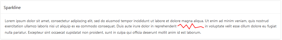
The result, without a single line of JavaScript code, is this region:

First spark chart

Considering that a sparkline is “a small intense, simple, word-sized graphic” putting it inside a paragraph like this is a reasonable use case. But my ultimate goal was to put it in interactive grid cells and I’ll get to that shortly. First there are two problems with what I have shown so far 1) the sparkline data values are hard coded, and 2) there is an unwanted chart on the page.

You can probably think of a number of ways for APEX to generate different data to render on the server side. The data should be formatted as a JSON array. It could be generated by a PL/SQL Dynamic Content region, or use a substitution, or use a Display Only item. A region plug-in doesn’t make sense for Spark Chart but an item plug-in could make sense for some use cases. But as this paragraph example shows Spark Charts can be used in many places where items don’t make sense. For now I’ll leave creating a Spark Chart item plug-in to someone else.

If you want to set or change the data on the client side it is easy to do with code such as:

$("#sparkLine1")[0].items = [1,3,2,4,5,6,1,4,3,4,5,2.5];

You can change the item values any time you like after the element has been initialized. Note the [0] after the jQuery object. This is because web components extend the methods and properties of DOM elements. You could use this equivalent code:

document.getElementById("sparkLine1").items = [1,3,2,4,5,6,1,4,3,4,5,2.5];

I said you can set the items array property after the element is initialized but when is that? If you want to set the items as soon as possible after the page loads and the element is initialized you will need to wait on a JET busyContext. For example in Execute when Page Loads you could do something like this:

require(["ojs/ojcore", "ojs/ojchart"], function(oj) {
    var sparkLine1 = document.getElementById("sparkLine1");
    var busyContext = oj.Context.getContext(sparkLine1).getBusyContext();
    busyContext.whenReady().then(function() {
        sparkLine1.items = [1,3,2,4,5,6,1,4,3,4,5,34];
    });
});

Now lets get rid of the unwanted chart. As we have seen it doesn’t take any code to initialize the Spark Chart so the question is what is the minimum necessary to get the needed JET libraries loaded. It turns out not much. Create a file called sparkchart.js with this one line as the content:

require(["ojs/ojchart"], function() {});

Then add it to Shared Components > Static Application Files and add a reference to the file in the page attribute JavaScript File URLs like this:

[require jet]#APP_IMAGES#sparkchart.js

This feels like a waste of a round trip to the sever for such a small file. If you already have an application JavaScript file consider adding this line to it. It seems like APEX should do something to make simple things like this easier.

To the page CSS File URLs add:

#JET_CSS_DIRECTORY#alta/oj-alta-notag-min.css

Now you can remove the Chart region. Taking a step back and realizing that once the JET libraries are loaded the Spark Chart is just markup it should be clear how to add them to Interactive Grid or other kinds of reports.

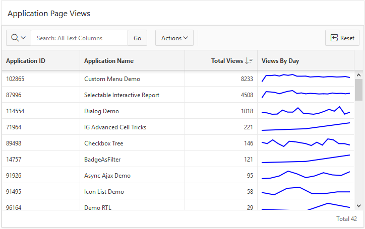
Here is an example. Add an Interactive Grid to the page with Title = Application Page Views. Set the SQL Query to:

select 
    application_id,
    application_name,
    (select count(*) from apex_activity_log where flow_id = ap.application_id) total_views,
    case when (select count(*) from apex_activity_log where flow_id = ap.application_id) > 0 then 
        (select json_arrayagg(views) 
             from (select trunc(TIME_STAMP) day, to_char(TIME_STAMP,'mm/dd/yyyy') day_format, count(*) views
                 from apex_activity_log where flow_id = ap.application_id
                 group by trunc(time_stamp),to_char(time_stamp,'mm/dd/yyyy')
                 order by trunc(time_stamp) desc))
    else
        '[]'
    end views_by_day
from apex_applications ap

This uses json_arrayagg to create the JSON array. If you have a database version less than 12.2 then you will have to make due without json_arrayagg. I managed to figure out how to use lastagg. It was a lot of fun learning and figuring out how to use the new JSON database capabilities. Figuring out this SQL query was the hardest part for me. Feel free to tell me how it can be done better.

Run the page as is just to see that the Views By Day column contains a JSON Array of numbers.

The last step is to change the VIEWS_BY_DAY column type to HTML Expression and enter this expression:

<oj-spark-chart id="sparkLine1" 
  type="line" 
  items="&VIEWS_BY_DAY."
  color="blue"
  line-width="2"
  class="cell-spark"></oj-spark-chart>

That is essentially all it takes. I changed a few other IG declarative attributes and added the following CSS rule so the sparkline would fill the whole cell.

.cell-spark {
    width: 100%;
}

I also I tweaked the report settings. The result can be seen in the screen shot at the start of this blog. It should be clear how Spark Charts can be used in Interactive Reports and Classic Reports. I nice thing about the IG implementation of HTML Expression columns is that the template is evaluated on the client so only the data is sent to the client not all the markup repeated for each cell.

It should be possible to do something very similar with the JET Avatar element but it seems to have a dependency on knockout that can’t be shaken.

Have fun adding these new data visualizations to your APEX apps.

APEX Inline Popups and Dialogs

$
0
0

Note this contains information about a future release of APEX and the final release may differ from what I describe.

I previously described how to create inline popup regions but with the upcoming APEX 19.1 release that should no longer be necessary because the Universal Theme should have a built-in Inline Popup Region. You can try it out already on the APEX Early Adopter site. Here I will provide up to date information on inline popups and dialogs.

APEX has had inline dialog regions since release 5.0 but they were overshadowed by the modal dialog page. I have always felt that inline dialog regions are not used as often as they could or should be. Now with the upcoming 19.1 release I think most of the pieces are in place to make it practical and easy enough to use inline dialogs and the new inline popups.

First a brief description of inline regions and modal dialog pages and the distinctions between them and also what a popup is.

The inline dialog and inline popup regions are like any other region. You create them by choosing the appropriate region template “Inline Dialog” or “Inline Popup”. They are rendered by the server and included as part of the HTML page that is sent to the browser. What makes them special is that they are not initially visible; they are turned into a dialog or popup widget when the page loads. Most normal page templates include a layout position called “Inline Dialogs”. Typically these inline regions are put in that position because it helps to hide them while the page is loading. You need to provide a way for users to open and close these regions with dynamic actions or JavaScript code. Once the region is open the user can interact with the region and form items or sub regions. Changes to page items in the region are not saved until the page is submitted. If needed you can load and save data using dynamic actions or JavaScript code.

The modal dialog page is a complete APEX page that loads in an iframe that is inside a dialog widget. The rendering and processing of the dialog page can leverage the full power of the APEX engine. The dialog is opened with a URL. The URL is actually JavaScript code but you create links to the modal dialog page with the Page Designer link builder or using the APEX_UTIL.PREPARE_URL API just like any other APEX page. The dialog is closed with either a dynamic action (Cancel Dialog or Close Dialog action) or the Close Dialog process.

I previously defined a popup as:

A popup is different from a dialog in these ways: It is always modal, does not have a title bar and cannot be resized or moved. It may have buttons that close it but it also closes when you click or touch outside of it or press the Escape key. It may be positioned near the artifact that caused it to open. Popups are commonly used in mobile apps.

Comparison between inline regions and modal dialog pages.

  • Inline Dialog and Inline Popup are APEX page regions.
  • Modal Dialog pages are full APEX pages.
  • Both modal dialog pages and inline dialog regions are implemented with the jQuery UI dialog widget.
  • Inline popup regions are implemented with the APEX popup widget which is derived from jQuery UI dialog.
  • An inline dialog region can be modal or non-modal but a dialog page is always modal. A non-modal dialog page is actually a separate browser window. There is no APEX page that is a popup (it makes no sense because popups should be lightweight).
  • A submit button in a modal dialog page submits the page (the one in the iframe in the dialog). The parent page remains unchanged.
  • A submit button in an inline region submits the page (the dialog content and the parent page are the same page).
  • Inline regions open very quickly. This is because they are already rendered on the client; there is no round trip to the server.
  • Modal dialog pages are slower to open because they must request the APEX page from the server.
  • Modal dialog pages are always opened in the top level APEX window (browsing context) so when they are stacked (Dialog: Chained = No) they can be moved anywhere on the page.
  • Inline dialogs and popups are always opened in the window they are in so if you add an inline dialog or popup to a modal dialog page they cannot be moved outside the modal dialog page iframe. This is why the modal dialog page templates don’t include the “Inline Dialogs” page position; inline dialogs are not that useful/user friendly inside modal dialog pages (but it is possible if you really want to do it). There may be added confusion for an inline popup region because clicking outside the popup to close it (regardless of noOverlay setting) only works for clicks in the same iframe. Clicking anywhere outside the iframe does nothing.
  • The chained concept does not apply to inline dialogs or popups (because it has to do with how navigating to a new dialog page is handled). However it is possible to implement wizard like behavior in an inline region simply by showing and hiding content as the user “moves” through the wizard.

I wrote about modal dialog pages before and also how to persist size and position and how to pass data in and out.

Here is whats new and planned for 19.1:

  • Universal Theme has a new region called Inline Popup as described above.
  • Both Inline Dialog and Inline Popup regions have a new template option “Remove Body Padding” that does just that. When the popup or dialog contains a large region such as a chart or interactive grid you probably don’t want the body padding. This removes the need for custom CSS that I had used to remove padding in the IG Cookbook when putting an interactive grid in a dialog.
  • The popup widget has a new option (noOverlay) that handles click outside to close without using an overlay. This is exposed as the inline popup region template option Remove Page Overlay. An overlay is what makes the dialog or popup modal and it makes the page “behind” the dialog look dim. It handles any clicks outside the dialog. For a popup the difference between using the overlay or not can be subtle. One thing is that the page is not dim with no overlay. The other is that with no overlay click outside the popup closes it and the click will also activate what it clicks on rather than being eaten by the overlay. Making noOverlay work in the presence of iframes was tricky. This option is motivated by the enhanced Popup LOV that is planned for a future release past 19.1.
  • Finally, built-in dynamic actions Open Region and Close Region that will open and close Inline Dialog and Popup regions. People have been asking for this for a long time.
  • Bonus: Open Region and Close Region work on collapsible regions as well to expand and collapse them.
  • The apex.theme openRegion and closeRegion APIs that I mentioned here are planned to be documented. These APIs implement the Open Region and Close Region dynamic actions.

Before APEX 5.0 some themes included some kind of primitive dialog support and these themes tended to have global functions called openModal and closeModal. These functions were never official parts of the APEX core library and were not officially documented. Universal Theme includes functions with the same name for backward compatibility but they should be considered deprecated. Ever since 5.0 when all our our dialogs switched to use jQuery UI dialog I have recommended to use the dialog open and close methods. For example $("#dialogid").dialog("open"). This is a bit long winded so starting in 18.2 the apex.theme namespace has openRegion and closeRegion functions. These should be documented in 19.1. In addition there are new Dynamic Action actions Open Region and Close Region that are based on these functions.

A nice thing about these new functions (or dynamic actions) is that they work with more than just dialogs (that is why the are not called open/closeDialog). As already mentioned they work with inline dialog, inline popup, and collapsible regions. In fact they should work with any region that is implemented with a jQuery UI widget that supports either the open and close methods or the expand and collapse methods. So if you implement a region plugin or region template that has similar functionality and appropriately named methods it should automatically work with these new dynamic actions and apex.theme functions.

The steps for incorporating an inline dialog or popup are now very simple:

  • Add a Static Content (or other type) region to the Inline Dialog page position. You can put
    whatever you like in the region.
  • Change the template to Inline Popup or Inline Dialog. Set template options as you like.
  • Create a button somewhere on the page to open the dialog or popup.
  • Create a dynamic action on the button and use action Open Region, selecting the inline region.
  • If you like you can add a button to the inline region to close the dialog or popup. Use the
    Close Region dynamic action for this button.

For this simple case there is no JavaScript required. More advanced topics will have to wait for another time.

We have converted most places in our sample apps to use the new functions to open and close dialogs. Hopefully we will get more examples of using popups and the new dynamic actions to open and close regions. The IG Cookbook has examples of inline dialogs or popups on pages 9, 11, 24, 25, 26, and 29. In addition the Custom Popup item plug-in included in that app works with either inline dialogs or popups. I hope to have an update to the IG Cookbook for 19.1 that uses the new DAs and the built-in inline popup region.

I hope to see more APEX apps using inline dialogs and popups going forward.

More APEX Menu Fun

$
0
0

During a recent APEX office hours Sven Weller asked a very interesting question about styling top navigation menus. The question was elaborated on in this forum post. There are a lot of details in that thread but the short answer is the out-of-the box top navigation menu doesn’t allow arbitrary markup or individually colored menu items. However the menu widget has many features and here I will show how to create rich custom content menus like the following.

Custom Menu

Menu bars, drop down menus, and popup menus have been around since the beginning of graphical user interfaces. There is value in consistency of look and feel so that users can immediately recognize and easily manipulate the menus. The APEX menu widget tries to follow as closely as possible the design guidelines for traditional desktop menus. This is why they don’t have icons in the menu bar and don’t allow different colors, etc. But in the wild west of web UI anything goes. As a result there are a number of bad web based menu designs and implementations. This isn’t to say that web designers haven’t come up with new effective UI; they have and some of the patterns have found their way back into desktop platforms. One of those patterns is the mega menu. There are a number of variations of mega menus and some are better than others. A nice thing about sticking with traditional menus is that you know they will be usable and accessible. For example the APEX menu fully supports keyboard navigation including typing characters to go to the next menu item that starts with that character.

To support mega menus, the APEX menu widget has a custom menu content option. I showed how this can be used to implement a custom popup mega menu but it also works with menu bars, which is the subject of this article. To be clear the menu bar itself does not allow custom markup but the drop down menus do. This way you get standard menu bar behavior such as right and left arrow key navigation, open on hover once opened, and the overflow menu on small screens. With custom content comes the responsibility to make sure that the drop down menu is usable and accessible but at least the basics like keyboard handling come for free.

Here are step by step instructions for creating an app like the one pictured above. It would be nice if there was an easy way to share a single template but the choices are to export a whole theme or a whole app. The steps seem long because I have to show all the template HTML but it is really quite simple and there is no new JavaScript. It is mainly just a new list template that is needed.

1. You will need an application to try this out on. I used the Sample Interactive Grids app because it already had interesting nested menus. It is a good idea to make a copy of the application.

2. Change the app to use top navigation. Go to Shared Components > User Interface Attributes > Desktop > Navigation Menu. Set Position to Top. For now leave the default list template Top Navigation Menu. If you run the app now you will see the normal APEX top navigation menus.

3. Copy the Top Navigation Menu template to a new template called Top Custom Menu. Go to Shared Components > Templates. Find the Top Navigation Menu and click the copy button. Then change the app to use this new template. Go back to the navigation menu settings from step 2 and change the List Template to the new Top Custom Menu. If you run the app again you will see that nothing has changed because we haven’t modified the template yet. The next few steps will modify the new template.

4. Edit the template. Go to Shared Components > Templates and click on the newly created Top Custom Menu. There are a number of changes to make so it can be helpful to check the Return to page checkbox.

5. This first change isn’t really necessary for the custom content menu but I think there is room for improvement in the built-in top menu template. I think that the menu bar should have a nice id like the side navigation tree does. The #PARENT_STATIC_ID# is not very useful when the list template is used for the navigation list (rather than a list region) as is intended for this template. At the same time the JavaScript code can be improved. It needs to use the new id and there is no need to check for apex.actions because it is always available now. I also think that the “NEXT” tabBehavior is more appropriate for this kind of menu.

Change the List Template Before Rows attribute to:

<div class="t-Header-nav-list #COMPONENT_CSS_CLASSES#" id="t_menuNav_menubar"><ul style="display:none">

Change the Execute when Page Loads attribute to:

var e = apex.jQuery("#t_menuNav_menubar", apex.gPageContext$);
if (e.hasClass("js-addActions")) {
  apex.actions.addFromMarkup( e );
}
e.menu({
  behaveLikeTabs: e.hasClass("js-tabLike"),
  menubarShowSubMenuIcon: e.hasClass("js-showSubMenuIcons") || null,
  slide: e.hasClass("js-slide"),
  menubar: true,
  menubarOverflow: true,
  tabBehavior: "NEXT"
});

6. Change the template markup. This is the most time consuming part especially when you are trying to figuring out the markup and style for the custom menus. The general idea is to use the menu markup data-custom="true" attribute on the top level list entries that have sub items. Then in the sub items we can put just about any markup we want. Here I choose to borrow some classes from the Universal Theme cards. Some of the summary information (icon and description) is placed in the top level list item even though it will show up in the drop down custom content menu. The data-icon attribute is removed from top level list items because, as the console debug warnings will tell you “Menu bar items cannot have icons.” No worries, the icon is put to good use in the custom content menu. In a later step attributes are defined for the #A06# description and #A07# color class.

Change the List Template Current attribute to:

<li data-current="true" data-id="#A01#" data-disabled="#A02#" data-hide="#A03#" data-shortcut="#A05#">
  <a href="#LINK#" title="#A04#">#TEXT_ESC_SC#</a>
</li>

Change the List Template Current with Sublist Items attribute to:

<li data-current="true" data-id="#A01#" data-disabled="#A02#" data-hide="#A03#" data-shortcut="#A05#" data-custom="true">
  <a href="#LINK#" title="#A04#">#TEXT_ESC_SC#</a>
  <div class="a-Menu-content t-Card">
    <div class="t-Card-icon force-fa-lg #A07#">
      <span class="t-Icon #ICON_CSS_CLASSES#"></span>
    </div>
    <div class="t-Card-desc a-Menu-item"><a href="#LINK#">#A06#</a></div>

Change the List Template Noncurrent attribute to:

<li data-id="#A01#" data-disabled="#A02#" data-hide="#A03#" data-shortcut="#A05#">
  <a href="#LINK#" title="#A04#">#TEXT_ESC_SC#</a>
</li>

Change the List Template Noncurrent with Sublist Items attribute to:

<li data-id="#A01#" data-disabled="#A02#" data-hide="#A03#" data-shortcut="#A05#" data-custom="true">
  <a href="#LINK#" title="#A04#">#TEXT_ESC_SC#</a>
  <div class="a-Menu-content t-Card">
    <div class="t-Card-icon force-fa-lg #A07#">
      <span class="t-Icon #ICON_CSS_CLASSES#"></span>
    </div>
    <div class="t-Card-desc a-Menu-item"><a href="#LINK#">#A06#</a></div>

Next are the sublist entries. These are simpler because the data attributes used to create a menu from markup don’t apply. The current menu indication isn’t supported so the current and non-current templates are identical.

Change the Before Sublist Template Before Rows attribute to:

<ul class="menu-items u-colors">

Note the use of Universal Theme classes like u-colors. This is used to assign a default color to each menu item.

Change the Sublist Template [Non]Current attributes to:

<li class="a-Menu-item">
  <span class="#A07# u-color"><a href="#LINK#" title="#A04#">
    <span class="#ICON_CSS_CLASSES#"></span>#TEXT_ESC_SC#
  </a>
  </span></li>

Change the Sublist Template [Non]Current with Sublist Items attributes to:

<li class="a-Menu-item">
  <span class="#A07# u-color"><a href="#LINK#" title="#A04#">
    <span class="#ICON_CSS_CLASSES#"></span>#TEXT_ESC_SC#
  </a>
  </span>

Change the Sublist Template After Rows attribute to:

</ul></div></li>

7. Add descriptions for the new attributes. Set #A06# to Description. The text of this attribute is shown at the top of the mega menu. Set #A07# to Color Class. This lets you specify the color of the menu item. If you don’t provide a color class then a default color is used just like the UT cards templates. Both of these attributes only apply to the sub list items. And the other attributes #A01#, #A02#, #A03#, and #A05# only apply to the top level list items.

That is the end of the template changes. If you run the page now you will see the drop down menus but they will look all messed up. This is because a number of CSS rules are needed to get the desired layout.

8. Add the needed CSS rules. Normally if you just have a few CSS rules you can add them to Cascading Style Sheet Inline attribute but there is currently a bug that keeps the CSS attributes from being rendered when the template is used for the navigation menu list. Another option is to put the CSS in a file. This can actually be a better idea because then the file can be cached by the browser.

Create a file called customMenu.css and add the following CSS to it:

.a-Menu-content.t-Card {
    padding: 4px 8px;
    margin: 0;
    flex-direction: row;
    flex-wrap: wrap;
    align-items: center;
}
.a-Menu-content.t-Card .t-Card-icon {
    display: flex;
    flex: none;
    margin: 8px;
    width: 64px;
    height: 64px;
}
.a-Menu-content.t-Card .menu-items {
    display: flex;
    flex-direction: column;
    flex-wrap: wrap;
    height: 120px;
    flex-grow: 1;
}
.a-Menu-content.t-Card .menu-items .a-Menu-item {
    display: inline-block;
    line-height: 20px;
    margin: 4px;
}
.a-Menu-content.t-Card .menu-items .a-Menu-item > span {
    display: inline-block;
    width: 100%;
}
.a-Menu-content.t-Card .a-Menu-item.is-focused,
.a-Menu-content.t-Card .a-Menu-item:hover {
    outline: 3px solid #7ac1fc;
}
.a-Menu-content.t-Card .a-Menu-label,
.a-Menu-content.t-Card .a-Menu-label.is-focused,
.a-Menu-content.t-Card .a-Menu-label:hover {
    padding: 4px 8px;
}
.a-Menu-content.t-Card .menu-items .a-Menu-label > span {
    margin-right: 8px;
    vertical-align: baseline;
}

Then upload the file to Shared Components > Static Application Files.

Add the reference to this file #APP_IMAGES#customMenu.css to the User Interface Details. Go to Shared Components > User Interface Attributes > Desktop > Cascading Style Sheets and add it to the list of File URLs.

9. The final step is to update the navigation list to take advantage of the capabilities of this new list template. Because I started with a copy of the Sample Interactive Grids app I edited the Desktop Navigation Menu list to add icons for all of the sub list items. For all the top level list entries that have sub entries add a description in the A06 user defined attributes. You can set specific colors for the menu items using a UT color class such as u-color-12 in A07.

Now when you run the app you should see drop down mega menus. I performed the above steps on a copy of the Sample Interactive Grids app on apex.oracle.com, which is currently on APEX 18.2. You can try out the results here. No authentication is needed and all editing has been disabled. The general technique should work on earlier versions perhaps even 5.0.x. I haven’t tried it myself. The big difference is going to be in Universal Theme so changes may be needed to the markup and CSS.

I also applied the same steps on the upcoming 19.1 release. That is where the above screen shot comes from. The differences in look are because of changes in Universal Theme menu styles. I think the 19.1 menus look better.

This is just a simple example of custom content (mega menus) in APEX. In the hands of a skilled web designer a wide range of amazing different looks should be possible. Just change the list template markup and CSS to suite your needs.

I hope that a future releas of APEX has some kind of mega menus built-in but even if that happens there will still be uses for your own custom templates when what APEX provides doesn’t satisfy your needs.

There are some limitations to this kind of menu. There is no nesting of sub menus at least not in the fly-out or popup sub menu sense. This example does not work with more than two levels but it may be possible with different markup to support nesting of menus. For example the 2nd level list items could be a group or category label and the 3rd level are links in that group. But the mega menu by design is always a single popup even if the links it contains have some structure. Another limitation is that the current menu designation (data-current) on sub menus doesn’t work. The same is true for other menu from markup settings like data-id or data-disabled. This makes it much harder to associate these mega menu sub menus with actions.

The advantage is much greater control over the markup and style. The markup is used as is rather than being turned into menu option configuration. This can be seen in title attribute tooltips that actually work whereas for the built-in top navigation menu the Title Attribute #A04# does nothing and is pointless.

If you try out mega menus in your app share a picture.

Viewing all 52 articles
Browse latest View live


<script src="https://jsc.adskeeper.com/r/s/rssing.com.1596347.js" async> </script>